Data Vis Chapter 6
p <-  ggplot(data = gapminder,
             mapping = aes(x = log(gdpPercap), y = lifeExp))

p + geom_point(alpha = 0.1) +
  geom_smooth(color = "tomato",
              fill = "tomato",
              method = MASS::rlm) + #robust regression line
  geom_smooth(color = "steelblue",
              fill = "steelblue",
              method = "lm")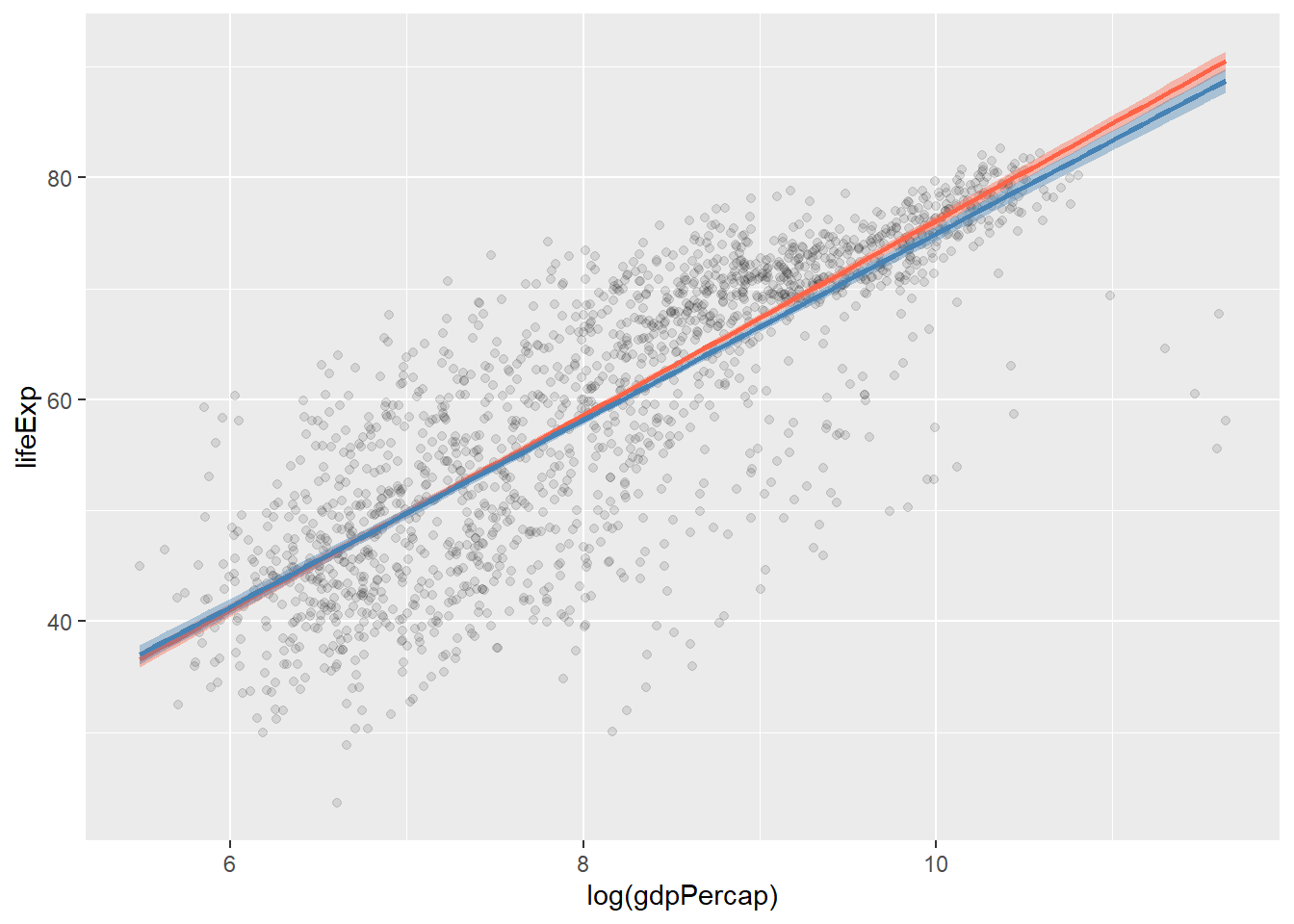
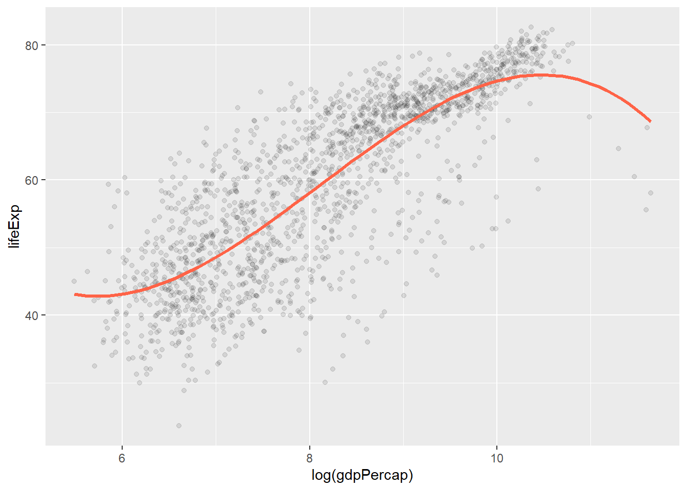
p + geom_point(alpha = 0.1) +
  geom_smooth(
    color = "tomato",
    method = "lm",
    size = 1.2,
    formula = y ~ splines::bs(x, 3),
    se = FALSE
  )
p + geom_point(alpha = 0.1) +
  geom_quantile( # specialized version of geom)smooth that can fit quantile regression
    color = "tomato",
    size = 1.2,
    method = "rqss",
    lambda = 1,
    quantiles = c(0.20, 0.5, 0.85)
  )
## Smoothing formula not specified. Using: y ~ qss(x, lambda = 1)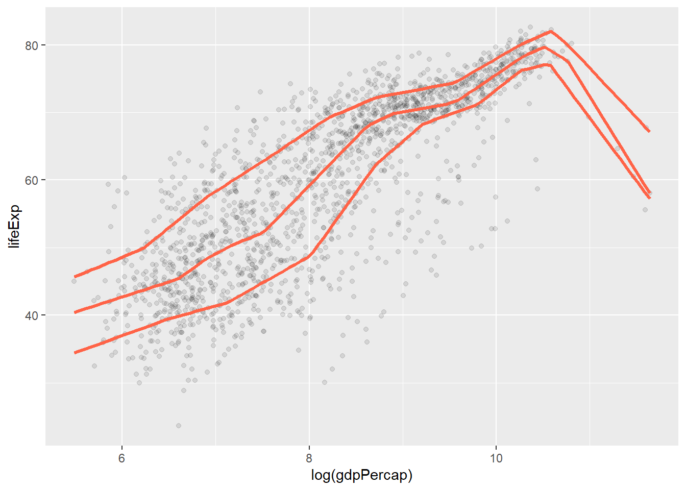
Show Several Fits at Once, with a Legend
model_colors <- RColorBrewer::brewer.pal(3, "Set1")
model_colors
## [1] "#E41A1C" "#377EB8" "#4DAF4A"p0 <- ggplot(data = gapminder,
mapping = aes(x = log(gdpPercap), y = lifeExp))
p1 <- p0 + geom_point(alpha = 0.2) +
geom_smooth(method = "lm", aes(color = "OLS", fill = "OLS")) +
geom_smooth(
method = "lm",
formula = y ~ splines::bs(x, df = 3),
aes(color = "Cubic Spline", fill = "Cubic Spline")
) +
geom_smooth(method = "loess",
aes(color = "LOESS", fill = "LOESS"))
p1 + scale_color_manual(name = "Models", values = model_colors) +
scale_fill_manual(name = "Models", values = model_colors) +
theme(legend.position = "top")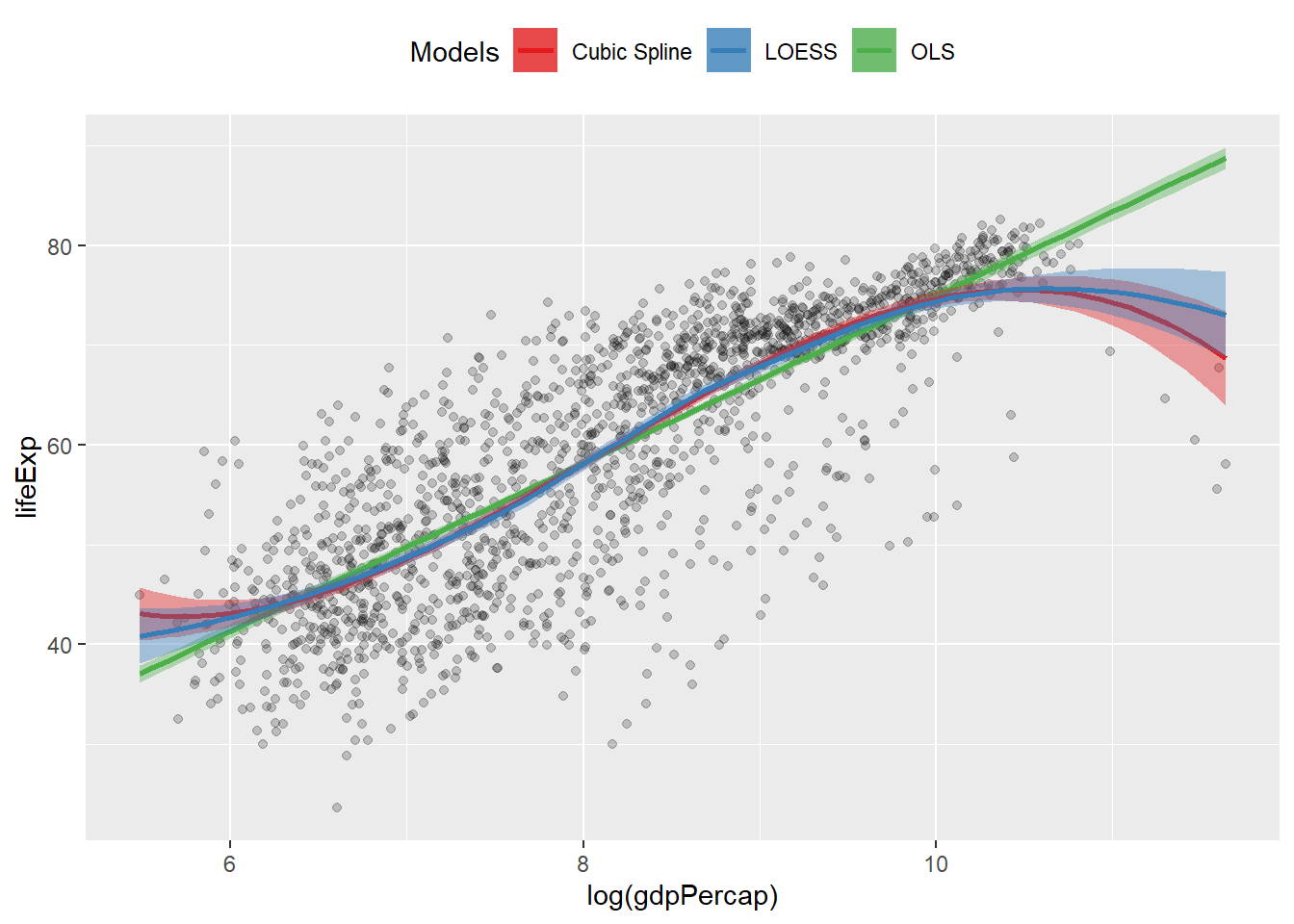
Model-based Graphics
min_gdp <- min(gapminder$gdpPercap)
max_gdp <- max(gapminder$gdpPercap)
med_pop <- median(gapminder$pop)

pred_df <- expand.grid(gdpPercap = (seq(from = min_gdp, to = max_gdp,
length.out = 100)), pop = med_pop, continent = c("Africa",
"Americas", "Asia", "Europe", "Oceania"))

dim(pred_df)
## [1] 500 3out <- lm(formula = lifeExp ~ gdpPercap + pop + continent, data = gapminder)
pred_out <- predict(object = out, newdata = pred_df, interval = "predict")
pred_df <- cbind(pred_df, pred_out)p <-
ggplot(
data = subset(pred_df, continent %in% c("Europe", "Africa")),
aes(
x = gdpPercap,
y = fit,
ymin = lwr,
ymax = upr,
color = continent,
fill = continent,
group = continent
)
)
p + geom_point(
data = subset(gapminder,
continent %in% c("Europe", "Africa")),
aes(x = gdpPercap, y = lifeExp,
color = continent),
alpha = 0.5,
inherit.aes = FALSE
) +
geom_line() +
geom_ribbon(alpha = 0.2, color = FALSE) +
scale_x_log10(labels = scales::dollar)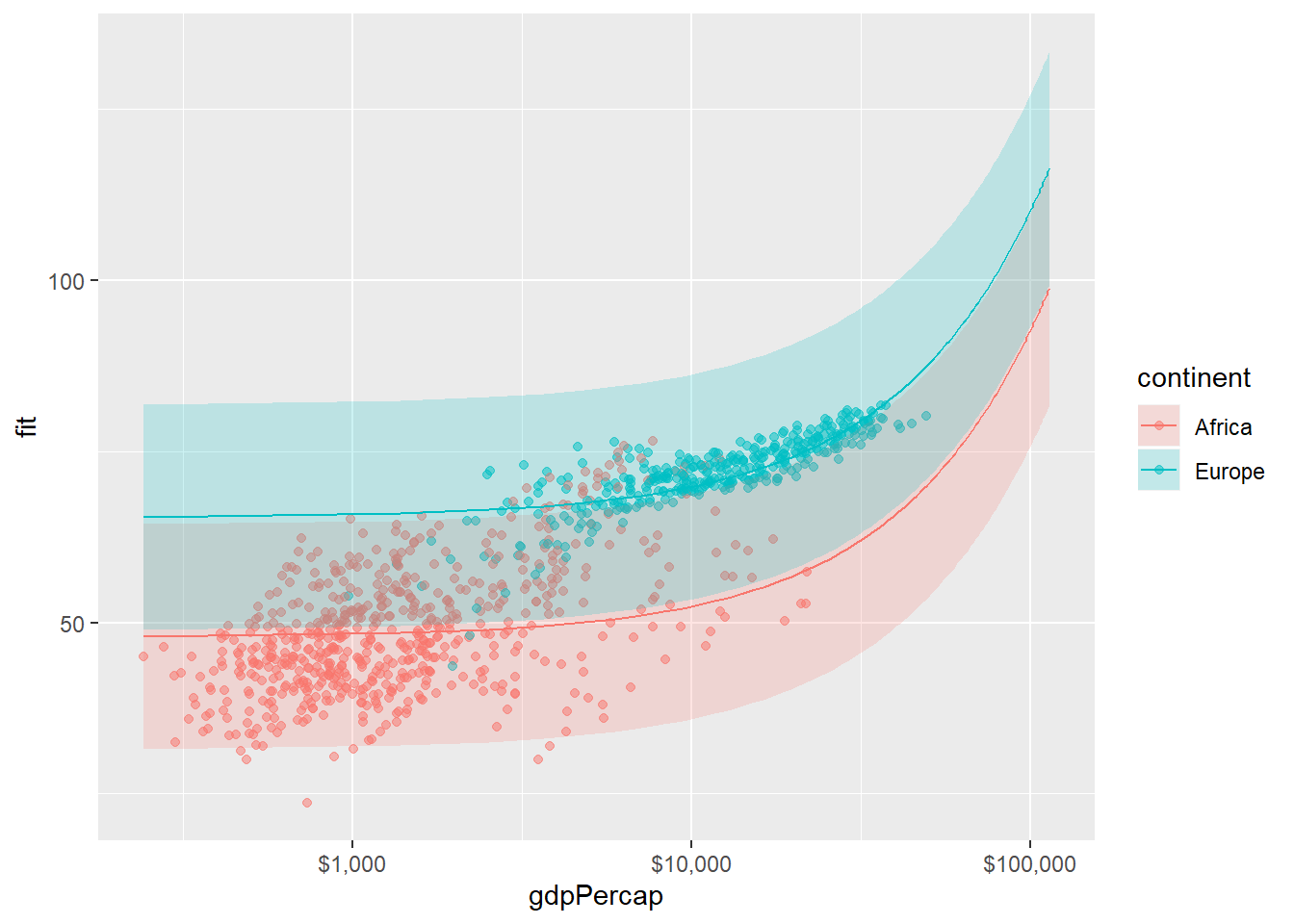
Tidy Model Objects with Broom
get component-level statistics with tidy()
library(broom)
out_comp <- tidy(out)
out_comp %>% round_df()
## # A tibble: 7 x 5
## term estimate std.error statistic p.value
## <chr> <dbl> <dbl> <dbl> <dbl>
## 1 (Intercept) 47.8 0.34 141. 0
## 2 gdpPercap 0 0 19.2 0
## 3 pop 0 0 3.33 0
## 4 continentAmericas 13.5 0.6 22.5 0
## 5 continentAsia 8.19 0.570 14.3 0
## 6 continentEurope 17.5 0.62 28.0 0
## 7 continentOceania 18.1 1.78 10.2 0“not in” %nin% is availabe via socviz.
prefix_strip from socviz drops prefixes
#confidence interval
out_conf <- tidy(out, conf.int = TRUE)
out_conf <- subset(out_conf, term %nin% "(Intercept)")
out_conf$nicelabs <- prefix_strip(out_conf$term, "continent")
p <- ggplot(out_conf,
mapping = aes(
x = reorder(nicelabs, estimate),
y = estimate,
ymin = conf.low,
ymax = conf.high
))
p + geom_pointrange() + coord_flip() + labs(x = "", y = "OLS Estimate")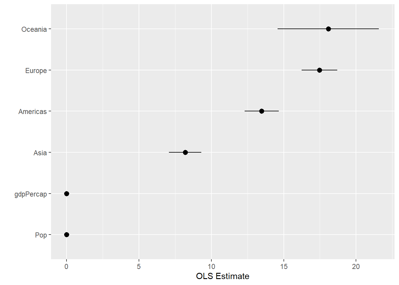
Get observation-level statistics with augment()
out_aug <- augment(out)
p <- ggplot(data = out_aug, mapping = aes(x = .fitted, y = .resid))
p + geom_point()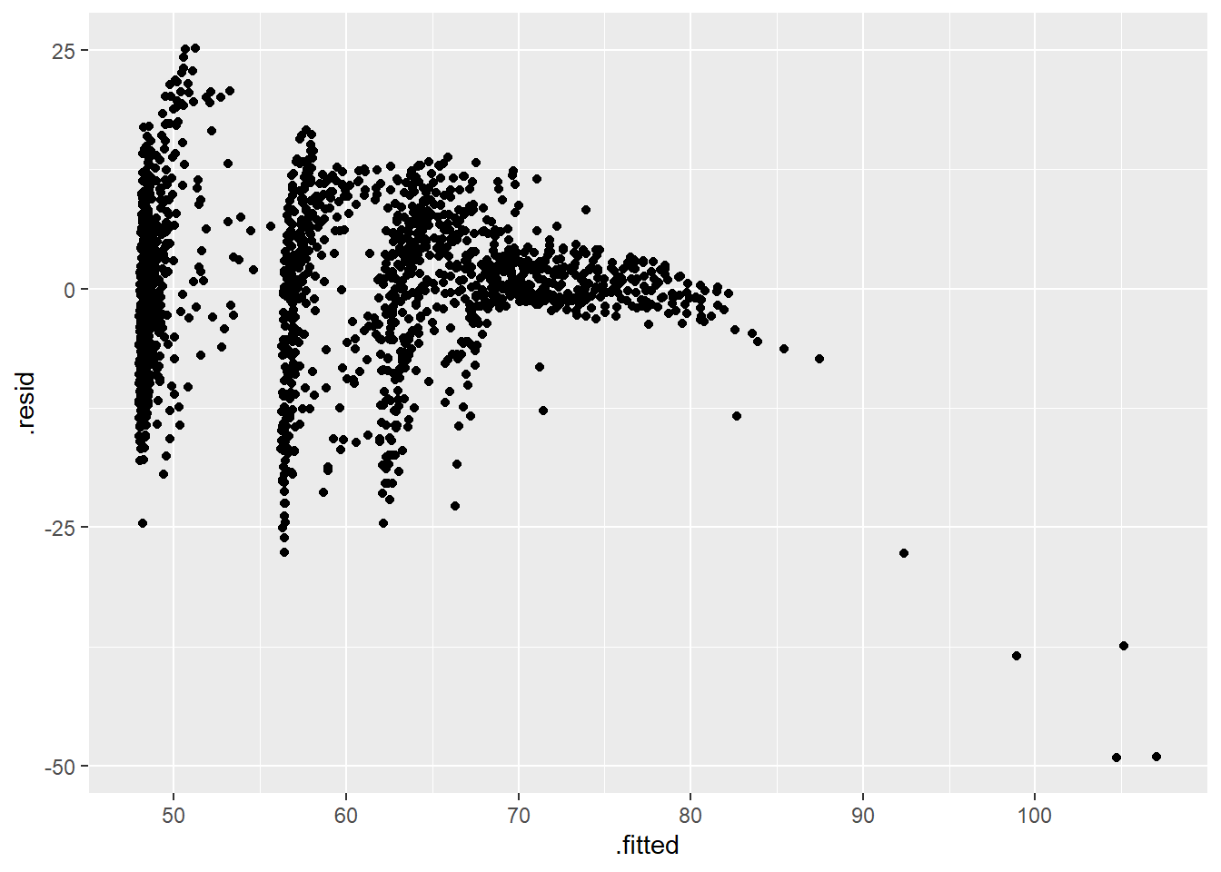 ### Get model-level statistics with glance()
Broom is able to
### Get model-level statistics with glance()
Broom is able to tidy (and augment, and glance at) a wide range of model types.
library(survival)

out_cph <- coxph(Surv(time, status) ~ age + sex, data = lung)
out_surv <- survfit(out_cph)
out_tidy <- tidy(out_surv)
p <- ggplot(data = out_tidy, mapping = aes(time, estimate))
p + geom_line() + geom_ribbon(mapping = aes(ymin = conf.low,
                                            ymax = conf.high),
                              alpha = 0.2)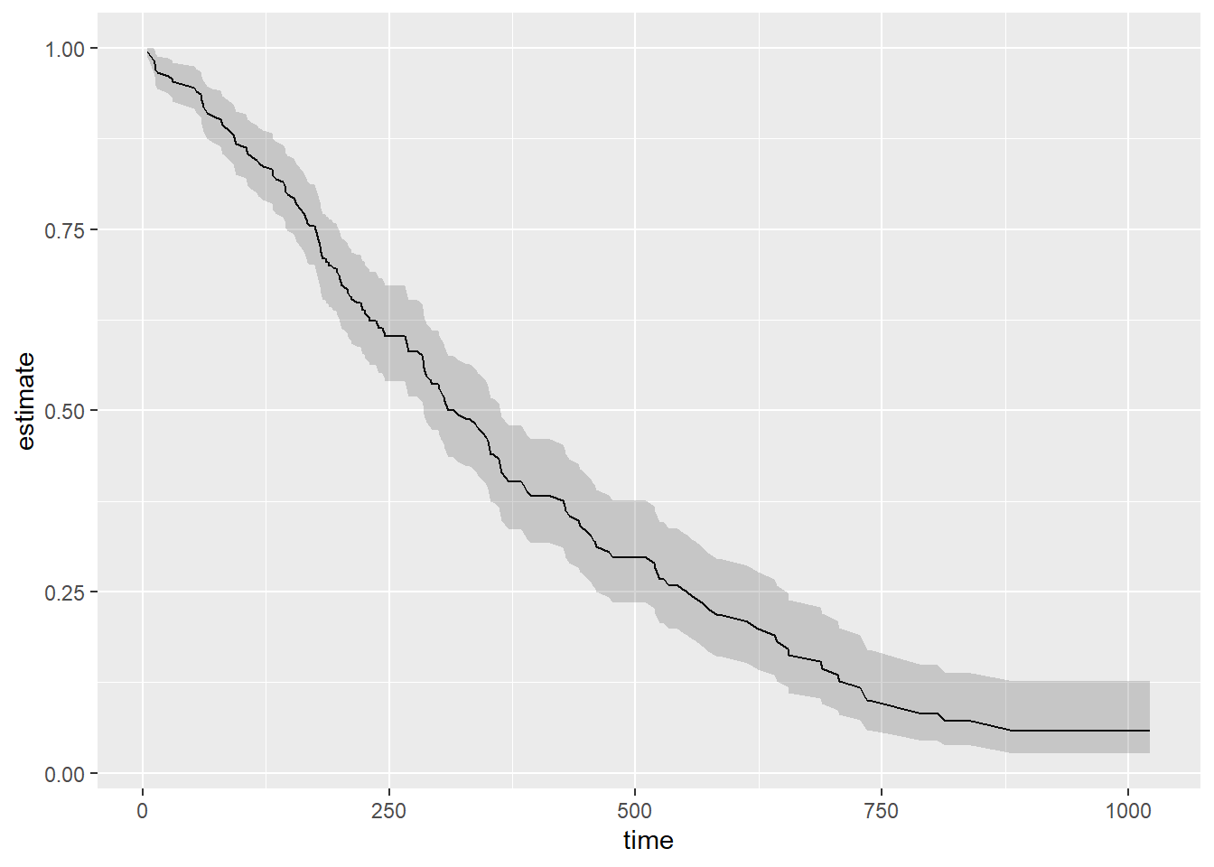
Grouped Analysis
nest and unnest
out_le <- gapminder %>%
  group_by(continent, year) %>%
  nest()
fit_ols <- function(df) {
lm(lifeExp ~ log(gdpPercap), data = df)
}
out_le <- gapminder %>%
group_by(continent, year) %>%
nest() %>%
mutate(model = map(data, fit_ols))
out_tidy <- gapminder %>%
group_by(continent, year) %>%
nest() %>%
mutate(model = map(data, fit_ols),
tidied = map(model, tidy)) %>%
unnest(tidied, .drop = TRUE) %>%
filter(term %nin% "(Intercept)" &
continent %nin% "Oceania")## Warning: The `.drop` argument of `unnest()` is deprecated as of tidyr 1.0.0.
## All list-columns are now preserved.
## This warning is displayed once per session.
## Call `lifecycle::last_warnings()` to see where this warning was generated.p <- ggplot(
data = out_tidy,
mapping = aes(
x = year,
y = estimate,
ymin = estimate - 2 * std.error,
ymax = estimate + 2 * std.error,
group = continent,
color = continent
)
)
p + geom_pointrange(position = position_dodge(width = 1)) +
scale_x_continuous(breaks = unique(gapminder$year)) +
theme(legend.position = "top") +
labs(x = "Year", y = "Estimate", color = "Continent")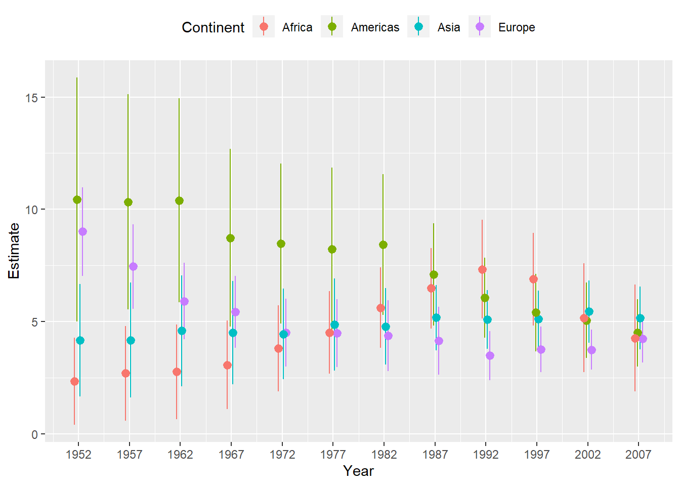 ## Plot Marginal Effects
library(margins)
gss_sm$polviews_m <- relevel(gss_sm$polviews, ref = "Moderate")
out_bo <- glm(obama ~ polviews_m + sex * race,
              family = "binomial",
              data = gss_sm)
summary(out_bo)
##
## Call:
## glm(formula = obama ~ polviews_m + sex * race, family = "binomial",
## data = gss_sm)
##
## Deviance Residuals:
## Min 1Q Median 3Q Max
## -2.9045 -0.5541 0.1772 0.5418 2.2437
##
## Coefficients:
## Estimate Std. Error z value Pr(>|z|)
## (Intercept) 0.296493 0.134091 2.211 0.02703 *
## polviews_mExtremely Liberal 2.372950 0.525045 4.520 6.20e-06 ***
## polviews_mLiberal 2.600031 0.356666 7.290 3.10e-13 ***
## polviews_mSlightly Liberal 1.293172 0.248435 5.205 1.94e-07 ***
## polviews_mSlightly Conservative -1.355277 0.181291 -7.476 7.68e-14 ***
## polviews_mConservative -2.347463 0.200384 -11.715 < 2e-16 ***
## polviews_mExtremely Conservative -2.727384 0.387210 -7.044 1.87e-12 ***
## sexFemale 0.254866 0.145370 1.753 0.07956 .
## raceBlack 3.849526 0.501319 7.679 1.61e-14 ***
## raceOther -0.002143 0.435763 -0.005 0.99608
## sexFemale:raceBlack -0.197506 0.660066 -0.299 0.76477
## sexFemale:raceOther 1.574829 0.587657 2.680 0.00737 **
## ---
## Signif. codes: 0 '***' 0.001 '**' 0.01 '*' 0.05 '.' 0.1 ' ' 1
##
## (Dispersion parameter for binomial family taken to be 1)
##
## Null deviance: 2247.9 on 1697 degrees of freedom
## Residual deviance: 1345.9 on 1686 degrees of freedom
## (1169 observations deleted due to missingness)
## AIC: 1369.9
##
## Number of Fisher Scoring iterations: 6bo_m <- margins(out_bo)
summary(bo_m)## factor AME SE z p lower
## polviews_mConservative -0.4119 0.0283 -14.5394 0.0000 -0.4674
## polviews_mExtremely Conservative -0.4538 0.0420 -10.7971 0.0000 -0.5361
## polviews_mExtremely Liberal 0.2681 0.0295 9.0996 0.0000 0.2103
## polviews_mLiberal 0.2768 0.0229 12.0736 0.0000 0.2319
## polviews_mSlightly Conservative -0.2658 0.0330 -8.0596 0.0000 -0.3304
## polviews_mSlightly Liberal 0.1933 0.0303 6.3896 0.0000 0.1340
## raceBlack 0.4032 0.0173 23.3568 0.0000 0.3694
## raceOther 0.1247 0.0386 3.2297 0.0012 0.0490
## sexFemale 0.0443 0.0177 2.5073 0.0122 0.0097
## upper
## -0.3564
## -0.3714
## 0.3258
## 0.3218
## -0.2011
## 0.2526
## 0.4371
## 0.2005
## 0.0789The margins library comes with several plot methods of its own. If you wish, at this point you can just try plot(bo_m) to see a plot of the average marginal effects, produced with the general look of a Stata graphic. Other plot methods in the margins
library include cplot(), which visualizes marginal effects conditional on a second variable, and image(), which shows predictions or marginal effects as a filled heatmap or contour plot.
bo_gg <- as_tibble(summary(bo_m))
prefixes <- c("polviews_m", "sex")
bo_gg$factor <- prefix_strip(bo_gg$factor, prefixes)
bo_gg$factor <- prefix_replace(bo_gg$factor, "race", "Race: ")

bo_gg %>% select(factor, AME, lower, upper)
## # A tibble: 9 x 4
## factor AME lower upper
## <chr> <dbl> <dbl> <dbl>
## 1 Conservative -0.412 -0.467 -0.356
## 2 Extremely Conservative -0.454 -0.536 -0.371
## 3 Extremely Liberal 0.268 0.210 0.326
## 4 Liberal 0.277 0.232 0.322
## 5 Slightly Conservative -0.266 -0.330 -0.201
## 6 Slightly Liberal 0.193 0.134 0.253
## 7 Race: Black 0.403 0.369 0.437
## 8 Race: Other 0.125 0.0490 0.200
## 9 Female 0.0443 0.00967 0.0789p <- ggplot(data = bo_gg, aes(
x = reorder(factor, AME),
y = AME,
ymin = lower,
ymax = upper
))
p + geom_hline(yintercept = 0, color = "gray80") +
geom_pointrange() + coord_flip() +
labs(x = NULL, y = "Average Marginal Effect")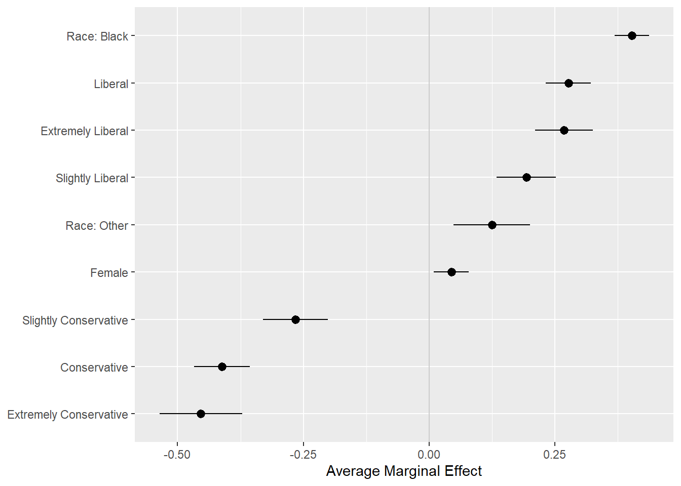
pv_cp <- cplot(out_bo, x = "sex", draw = FALSE)## xvals yvals upper lower
## 1 Male 0.5735849 0.6378653 0.5093045
## 2 Female 0.6344507 0.6887845 0.5801169p <- ggplot(data = pv_cp, aes(
x = reorder(xvals, yvals),
y = yvals,
ymin = lower,
ymax = upper
))
p + geom_hline(yintercept = 0, color = "gray80") +
geom_pointrange() + coord_flip() +
labs(x = NULL, y = "Conditional Effect")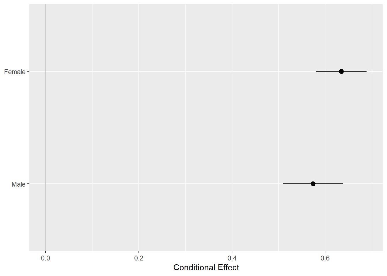
Plots for Surveys
library(survey)## Loading required package: grid## Loading required package: Matrix##
## Attaching package: 'Matrix'## The following objects are masked from 'package:tidyr':
##
## expand, pack, unpack##
## Attaching package: 'survey'## The following object is masked from 'package:graphics':
##
## dotchartlibrary(srvyr)##
## Attaching package: 'srvyr'## The following object is masked from 'package:stats':
##
## filteroptions(survey.lonely.psu = "adjust")
options(na.action = "na.pass")
gss_wt <- subset(gss_lon, year > 1974) %>%
mutate(stratvar = interaction(year, vstrat)) %>%
as_survey_design(
ids = vpsu,
strata = stratvar,
weights = wtssall,
nest = TRUE
)
out_grp <- gss_wt %>%
filter(year %in% seq(1976, 2016, by = 4)) %>%
group_by(year, race, degree) %>%
summarize(prop = survey_mean(na.rm = TRUE)) # calculate properly weighted survey means## Warning: Factor `degree` contains implicit NA, consider using
## `forcats::fct_explicit_na`out_mrg <- gss_wt %>%
filter(year %in% seq(1976, 2016, by = 4)) %>%
mutate(racedeg = interaction(race, degree)) %>%
group_by(year, racedeg) %>%
summarize(prop = survey_mean(na.rm = TRUE))## Warning: Factor `racedeg` contains implicit NA, consider using
## `forcats::fct_explicit_na`out_mrg <- gss_wt %>% filter(year %in% seq(1976, 2016, by = 4)) %>%
mutate(racedeg = interaction(race, degree)) %>% group_by(year,
racedeg) %>%
summarize(prop = survey_mean(na.rm = TRUE)) %>%
separate(racedeg, sep = "\\.", into = c("race", "degree")) ## Warning: Factor `racedeg` contains implicit NA, consider using
## `forcats::fct_explicit_na`p <- ggplot(
data = subset(out_grp, race %nin% "Other"),
mapping = aes(
x = degree,
y = prop,
ymin = prop - 2 * prop_se,
ymax = prop + 2 * prop_se,
fill = race,
color = race,
group = race
)
)
dodge <- position_dodge(width = 0.9)
p + geom_col(position = dodge, alpha = 0.2) +
geom_errorbar(position = dodge, width = 0.2) +
scale_x_discrete(labels = scales::wrap_format(10)) +
scale_y_continuous(labels = scales::percent) +
scale_color_brewer(type = "qual", palette = "Dark2") +
scale_fill_brewer(type = "qual", palette = "Dark2") +
labs(
title = "Educational Attainment by Race",
subtitle = "GSS 1976-2016",
fill = "Race",
color = "Race",
x = NULL,
y = "Percent"
) +
facet_wrap( ~ year, ncol = 2) +
theme(legend.position = "top")## Warning: Removed 13 rows containing missing values (geom_col).## Warning: Removed 13 rows containing missing values (geom_errorbar).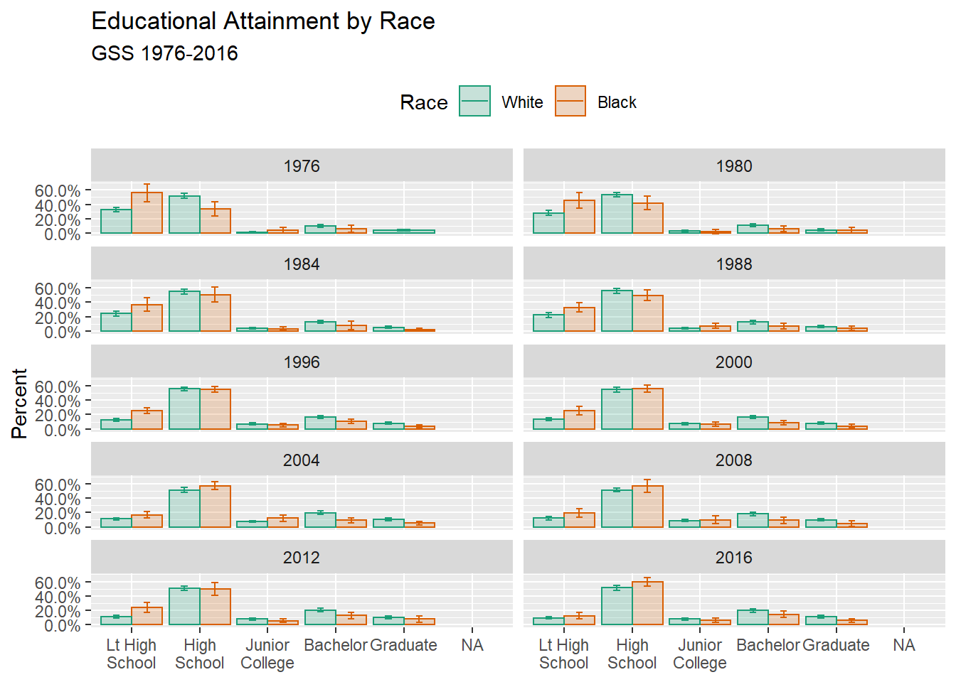
p <- ggplot(
  data = subset(out_grp, race %nin% "Other"),
  mapping = aes(
    x = year,
    y = prop,
    ymin = prop - 2 * prop_se,
    ymax = prop + 2 * prop_se,
    fill = race,
    color = race,
    group = race
  )
)

p + geom_ribbon(alpha = 0.3, aes(color = NULL)) + #Use ribbon to show the error range
  geom_line() + #Use line to show a time trend
  facet_wrap( ~ degree, ncol = 1) +
  scale_y_continuous(labels = scales::percent) +
  scale_color_brewer(type = "qual", palette = "Dark2") +
  scale_fill_brewer(type = "qual", palette = "Dark2") +
  labs(
    title = "Educational Attainment by Race",
    subtitle = "GSS 1976-2016",
    fill = "Race",
    color = "Race",
    x = NULL,
    y = "Percent"
  ) +
  theme(legend.position = "top")
## Warning: Removed 13 rows containing missing values (geom_path).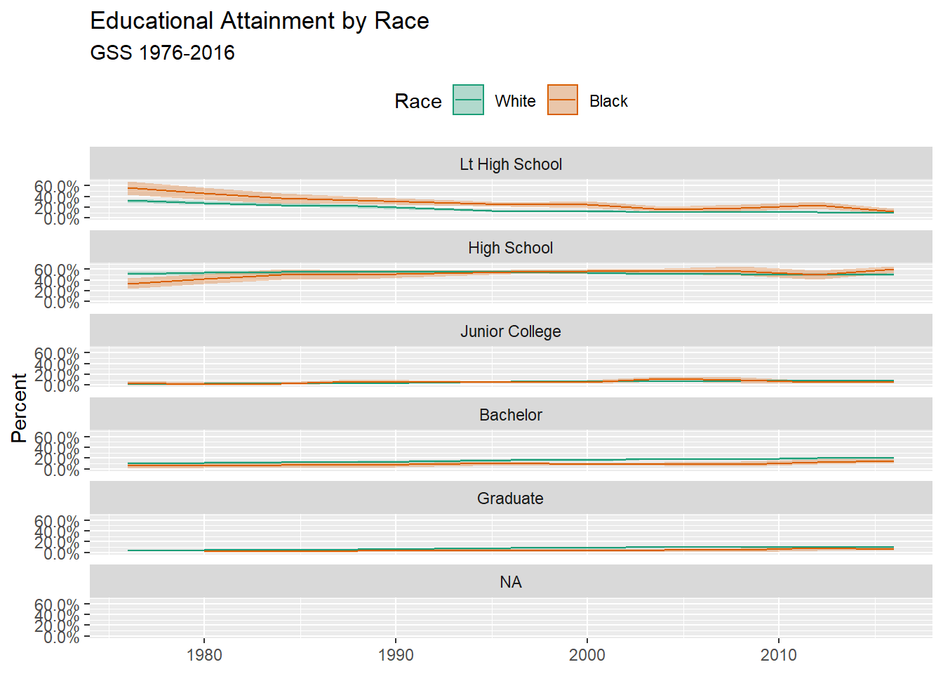
Other useful packages: infer, ggally
Yihong WANG
Wayfaring Stranger