Data Visualization Chapter 5
Chapter 5
Use Pipes to Summerize Data
rel_by_region <- gss_sm %>%
  group_by(bigregion, religion) %>%
  summarize(N = n()) %>%
  mutate(freq = N / sum(N),
         pct = round((freq*100), 0))
## Warning: Factor `religion` contains implicit NA, consider using
## `forcats::fct_explicit_na`rel_by_region## # A tibble: 24 x 5
## # Groups: bigregion [4]
## bigregion religion N freq pct
## <fct> <fct> <int> <dbl> <dbl>
## 1 Northeast Protestant 158 0.324 32
## 2 Northeast Catholic 162 0.332 33
## 3 Northeast Jewish 27 0.0553 6
## 4 Northeast None 112 0.230 23
## 5 Northeast Other 28 0.0574 6
## 6 Northeast <NA> 1 0.00205 0
## 7 Midwest Protestant 325 0.468 47
## 8 Midwest Catholic 172 0.247 25
## 9 Midwest Jewish 3 0.00432 0
## 10 Midwest None 157 0.226 23
## # … with 14 more rowsrel_by_region %>% group_by(bigregion) %>% summarize(total = sum(pct))## # A tibble: 4 x 2
## bigregion total
## <fct> <dbl>
## 1 Northeast 100
## 2 Midwest 101
## 3 South 100
## 4 West 101p <- ggplot(rel_by_region, aes(x = bigregion, y = pct, fill = religion))
p + geom_col(position = "dodge2") +
labs(x = "Region",y = "Percent", fill = "Religion") +
theme(legend.position = "top")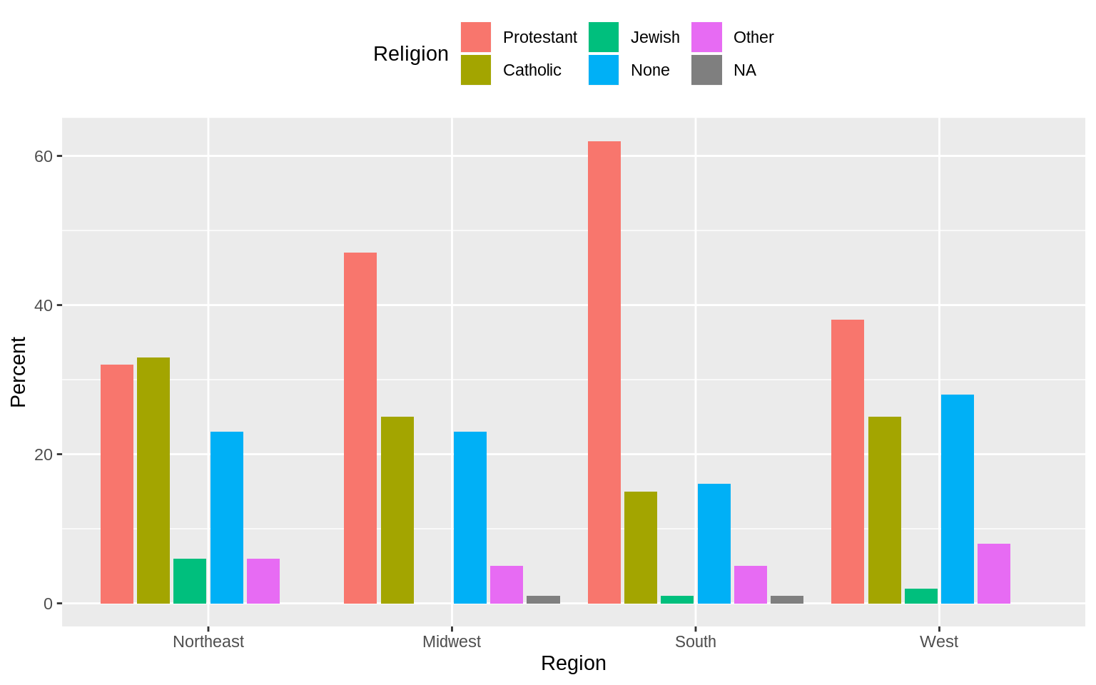 Use
Use coord_flip()
p <- ggplot(rel_by_region, aes(x = bigregion, y = pct, fill = religion))
p + geom_col(position = "dodge2") +
  labs(x = "Region",y = "Percent", fill = "Religion") +
  guides(fill = FALSE) +
  coord_flip() +
  facet_grid(~ bigregion)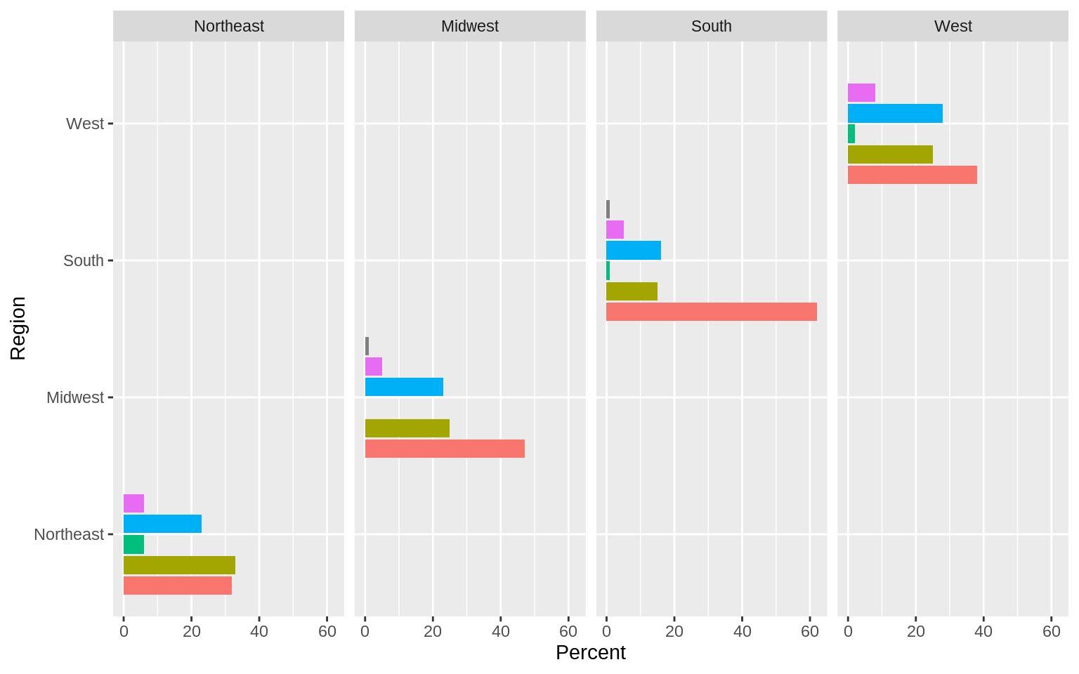
p <- ggplot(rel_by_region, aes(x = religion, y = pct, fill = religion))
p + geom_col(position = "dodge2") +
  labs(x = NULL,y = "Percent", fill = "Religion") +
  guides(fill = FALSE) +
  coord_flip() +
  facet_grid(~ bigregion)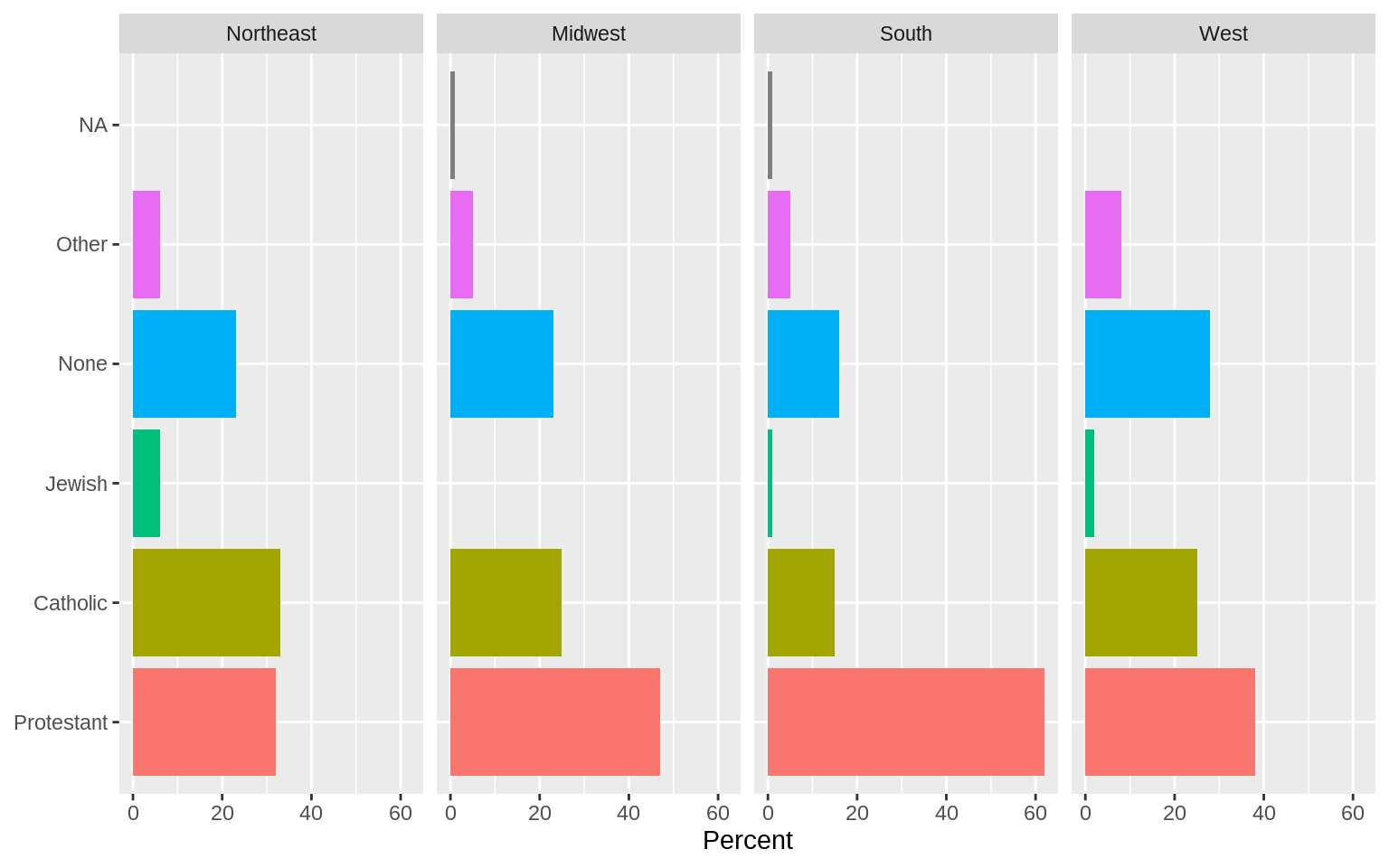
Continuous Variables by Group or Category
p <- ggplot(data = organdata, mapping = aes(x = year, y = donors))
p + geom_line(aes(group = country)) + facet_wrap(~country)
## Warning: Removed 34 rows containing missing values (geom_path).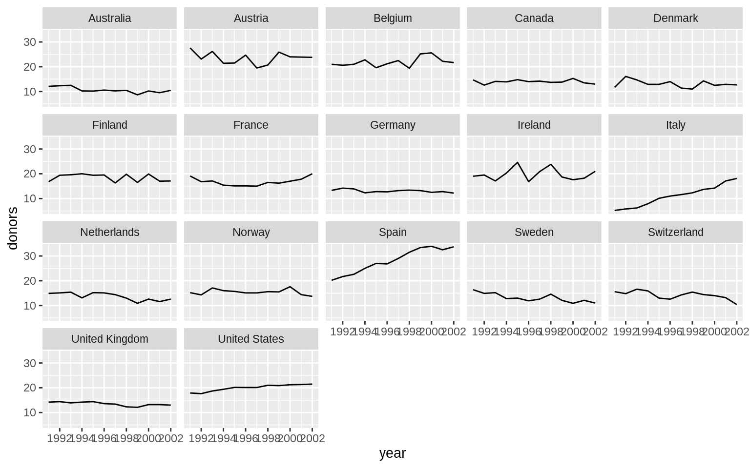
p <- ggplot(data = organdata, mapping = aes(x = country, y = donors))
p + geom_boxplot() + coord_flip()
## Warning: Removed 34 rows containing non-finite values (stat_boxplot).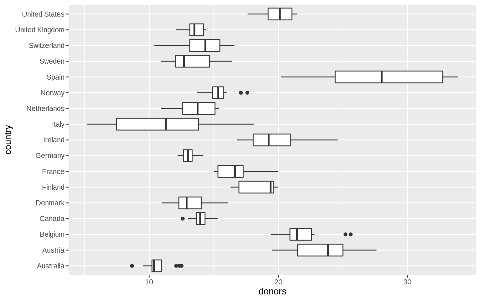
p <- ggplot(data = organdata, mapping = aes(x = reorder(country,
                                                        donors, na.rm = TRUE), y = donors))
p + geom_boxplot() + labs(x = NULL) + coord_flip()
## Warning: Removed 34 rows containing non-finite values (stat_boxplot).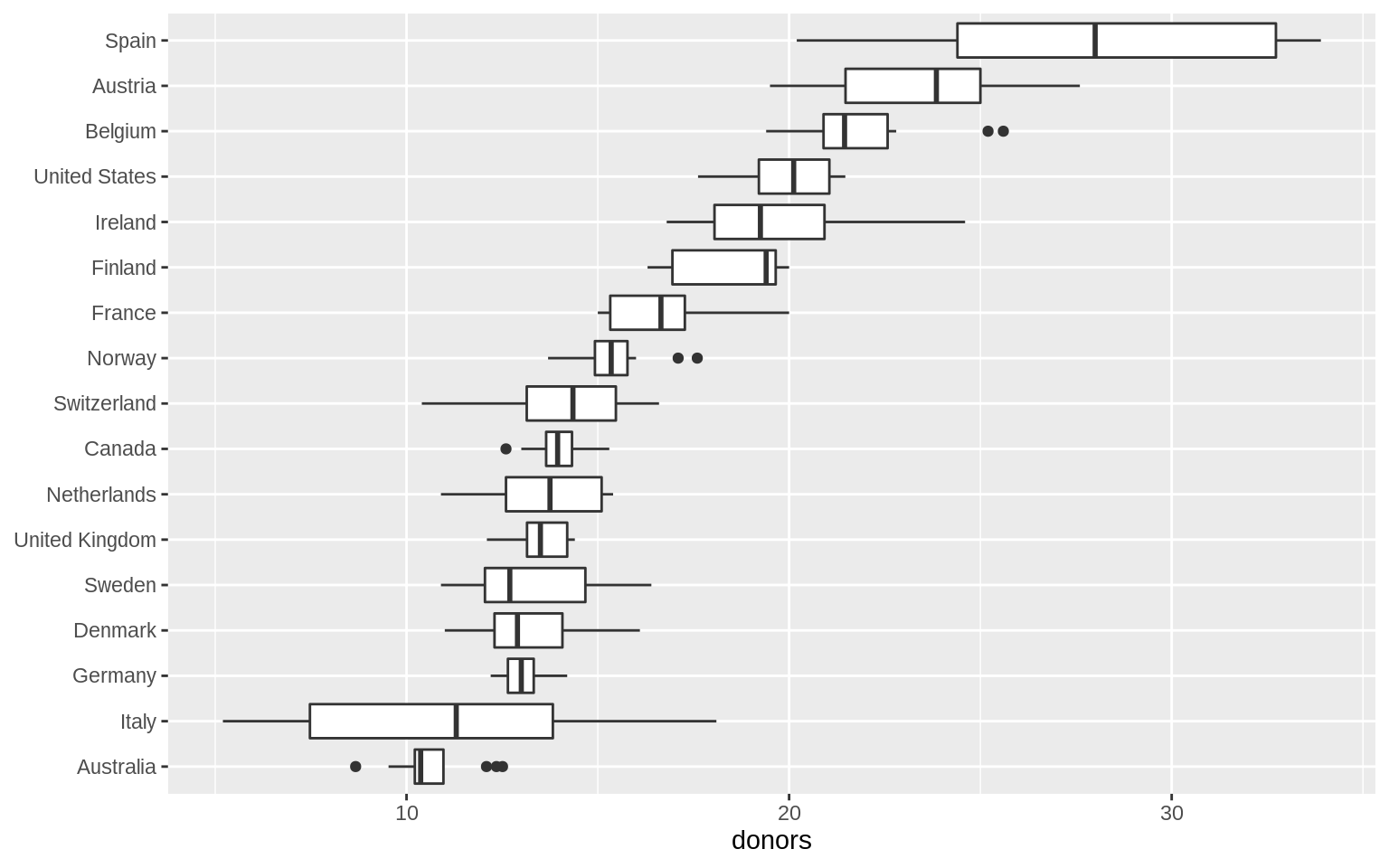
p <- ggplot(data = organdata, mapping = aes(x = reorder(country, donors, na.rm = TRUE),
                                            y = donors, fill = world))
p + geom_boxplot() + labs(x = NULL) +
  coord_flip() + theme(legend.position = "top")
## Warning: Removed 34 rows containing non-finite values (stat_boxplot).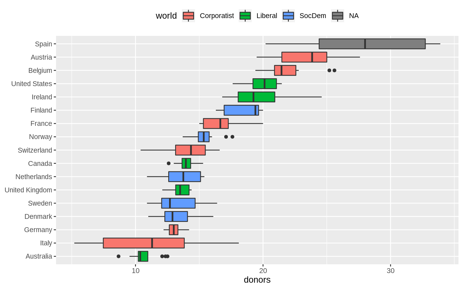
p <- ggplot(data = organdata, mapping = aes(x = reorder(country, donors, na.rm = TRUE),
                                            y = donors, color = world))
p + geom_point() + labs(x = NULL) +
  coord_flip() + theme(legend.position = "top")
## Warning: Removed 34 rows containing missing values (geom_point).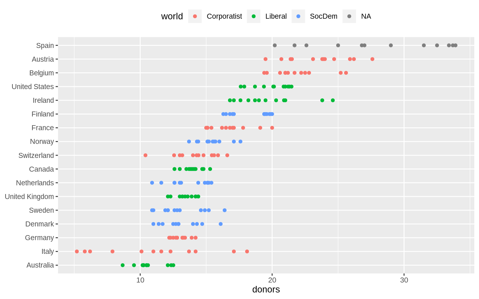
p <-
  ggplot(data = organdata,
         mapping = aes(
           x = reorder(country, donors, na.rm = TRUE),
           y = donors,
           color = world
         ))
p + geom_jitter() + labs(x = NULL) +
  coord_flip() + theme(legend.position = "top")
## Warning: Removed 34 rows containing missing values (geom_point).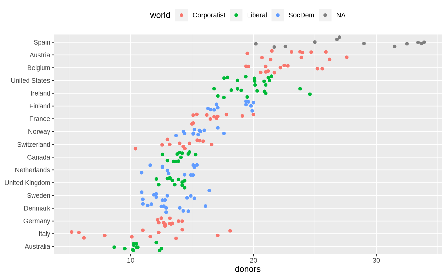
p <-
  ggplot(data = organdata,
         mapping = aes(
           x = reorder(country, donors, na.rm = TRUE),
           y = donors,
           color = world
         ))
p + geom_jitter(position = position_jitter(width = 0.15)) + labs(x = NULL) +
  coord_flip() + theme(legend.position = "top")
## Warning: Removed 34 rows containing missing values (geom_point).
by_country <-
  organdata %>% group_by(consent_law, country) %>% summarize(
    donors_mean = mean(donors, na.rm = TRUE),
    donors_sd = sd(donors, na.rm = TRUE),
    gdp_mean = mean(gdp, na.rm = TRUE),
    health_mean = mean(health, na.rm = TRUE),
    roads_mean = mean(roads, na.rm = TRUE),
    cerebvas_mean = mean(cerebvas, na.rm = TRUE)
)by_country## # A tibble: 17 x 8
## # Groups: consent_law [2]
## consent_law country donors_mean donors_sd gdp_mean health_mean
## <chr> <chr> <dbl> <dbl> <dbl> <dbl>
## 1 Informed Austra… 10.6 1.14 22179. 1958.
## 2 Informed Canada 14.0 0.751 23711. 2272.
## 3 Informed Denmark 13.1 1.47 23722. 2054.
## 4 Informed Germany 13.0 0.611 22163. 2349.
## 5 Informed Ireland 19.8 2.48 20824. 1480.
## 6 Informed Nether… 13.7 1.55 23013. 1993.
## 7 Informed United… 13.5 0.775 21359. 1561.
## 8 Informed United… 20.0 1.33 29212. 3988.
## 9 Presumed Austria 23.5 2.42 23876. 1875.
## 10 Presumed Belgium 21.9 1.94 22500. 1958.
## 11 Presumed Finland 18.4 1.53 21019. 1615.
## 12 Presumed France 16.8 1.60 22603. 2160.
## 13 Presumed Italy 11.1 4.28 21554. 1757
## 14 Presumed Norway 15.4 1.11 26448. 2217.
## 15 Presumed Spain 28.1 4.96 16933 1289.
## 16 Presumed Sweden 13.1 1.75 22415. 1951.
## 17 Presumed Switze… 14.2 1.71 27233 2776.
## # … with 2 more variables: roads_mean <dbl>, cerebvas_mean <dbl>by_country <- organdata %>% group_by(consent_law, country) %>%
summarize_if(is.numeric, lst(mean, sd), na.rm = TRUE) %>%
ungroup()
by_country## # A tibble: 17 x 28
## consent_law country donors_mean pop_mean pop_dens_mean gdp_mean
## <chr> <chr> <dbl> <dbl> <dbl> <dbl>
## 1 Informed Austra… 10.6 18318. 0.237 22179.
## 2 Informed Canada 14.0 29608. 0.297 23711.
## 3 Informed Denmark 13.1 5257. 12.2 23722.
## 4 Informed Germany 13.0 80255. 22.5 22163.
## 5 Informed Ireland 19.8 3674. 5.23 20824.
## 6 Informed Nether… 13.7 15548. 37.4 23013.
## 7 Informed United… 13.5 58187. 24.0 21359.
## 8 Informed United… 20.0 269330. 2.80 29212.
## 9 Presumed Austria 23.5 7927. 9.45 23876.
## 10 Presumed Belgium 21.9 10153. 30.7 22500.
## 11 Presumed Finland 18.4 5112. 1.51 21019.
## 12 Presumed France 16.8 58056. 10.5 22603.
## 13 Presumed Italy 11.1 57360. 19.0 21554.
## 14 Presumed Norway 15.4 4386. 1.35 26448.
## 15 Presumed Spain 28.1 39666. 7.84 16933
## 16 Presumed Sweden 13.1 8789. 1.95 22415.
## 17 Presumed Switze… 14.2 7037. 17.0 27233
## # … with 22 more variables: gdp_lag_mean <dbl>, health_mean <dbl>,
## # health_lag_mean <dbl>, pubhealth_mean <dbl>, roads_mean <dbl>,
## # cerebvas_mean <dbl>, assault_mean <dbl>, external_mean <dbl>,
## # txp_pop_mean <dbl>, donors_sd <dbl>, pop_sd <dbl>, pop_dens_sd <dbl>,
## # gdp_sd <dbl>, gdp_lag_sd <dbl>, health_sd <dbl>, health_lag_sd <dbl>,
## # pubhealth_sd <dbl>, roads_sd <dbl>, cerebvas_sd <dbl>,
## # assault_sd <dbl>, external_sd <dbl>, txp_pop_sd <dbl>p <- ggplot(data = by_country,
mapping = aes(
x = donors_mean,
y = reorder(country, donors_mean),
color = consent_law
))
p + geom_point(size = 3) +
labs(x = "Donor Procurement Rate",
y = "", color = "Consent Law") +
theme(legend.position = "top")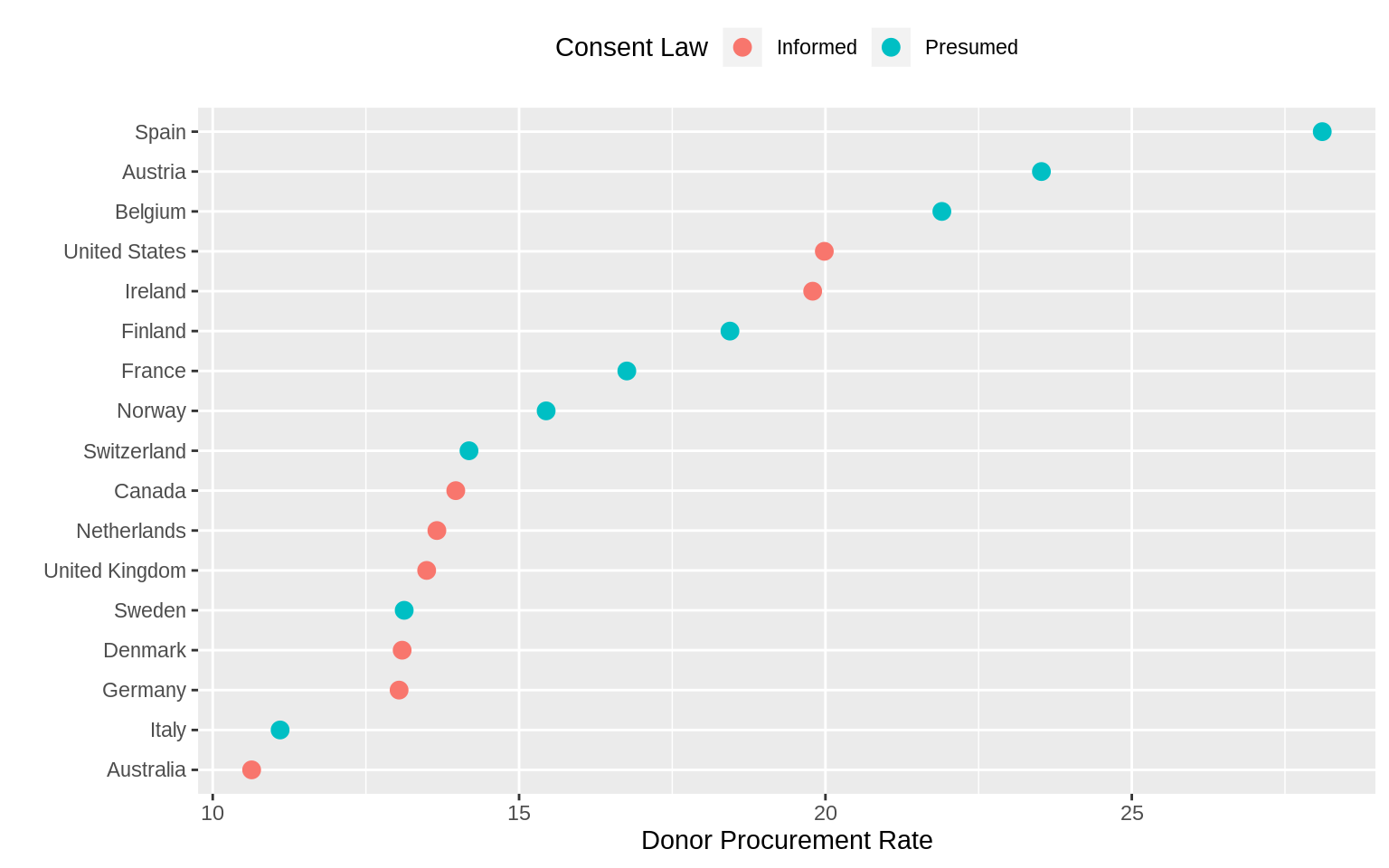
p <- ggplot(data = by_country,
            mapping = aes(x = donors_mean,
                          y = reorder(country, donors_mean)))

p + geom_point(size = 3) +
  facet_wrap( ~ consent_law, scales = "free_y", ncol = 1) +
  labs(x = "Donor Procurement Rate",
       y = "")
p <- ggplot(data = by_country,
mapping = aes(x = reorder(country,
donors_mean), y = donors_mean))
p + geom_pointrange(mapping = aes(ymin = donors_mean - donors_sd,
ymax = donors_mean + donors_sd)) +
labs(x = "", y = "Donor Procurement Rate") + coord_flip()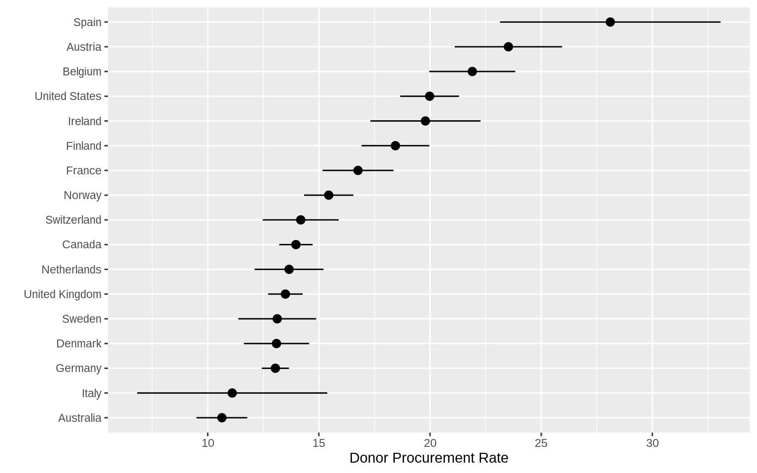 ### Plot Text Directly
p <- ggplot(data = by_country,
            mapping = aes(x = roads_mean,
                          y = donors_mean))
p + geom_point() + geom_text(mapping = aes(label = country))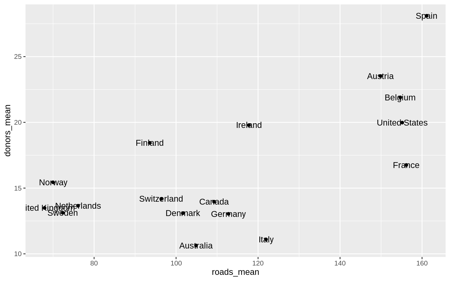
p <- ggplot(data = by_country,
mapping = aes(x = roads_mean,
y = donors_mean))
p + geom_point() + geom_text(mapping = aes(label = country), hjust = 0)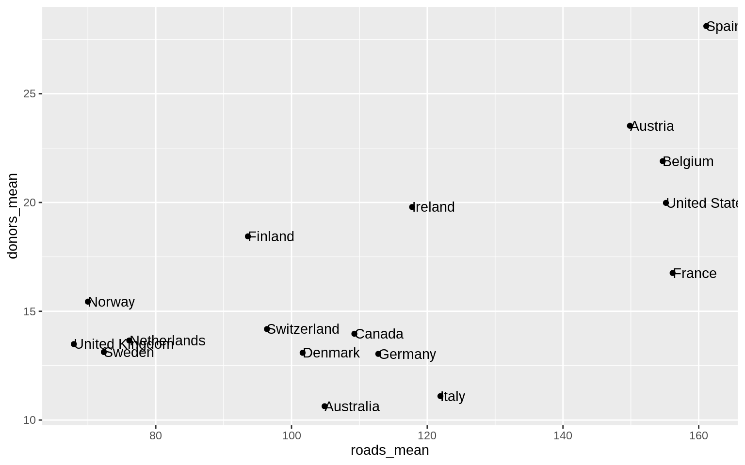 ggrepel is better than
 geom_text()
library(ggrepel)p_title <-
"Presidential Elections: Popular & Electoral College Margins"
p_subtitle <- "1824-2016"
p_caption <- "Data for 2016 are provisional."
x_label <- "Winner's share of Popular Vote"
y_label <- "Winner's share of Electoral College Votes"
p <- ggplot(elections_historic,
aes(x = popular_pct, y = ec_pct,
label = winner_label))
p + geom_hline(yintercept = 0.5,
size = 1.4,
color = "gray80") +
geom_vline(xintercept = 0.5,
size = 1.4,
color = "gray80") +
geom_point() +
geom_text_repel() +
scale_x_continuous(labels = scales::percent) +
scale_y_continuous(labels = scales::percent) +
labs(
x = x_label,
y = y_label,
title = p_title,
subtitle = p_subtitle,
caption = p_caption
)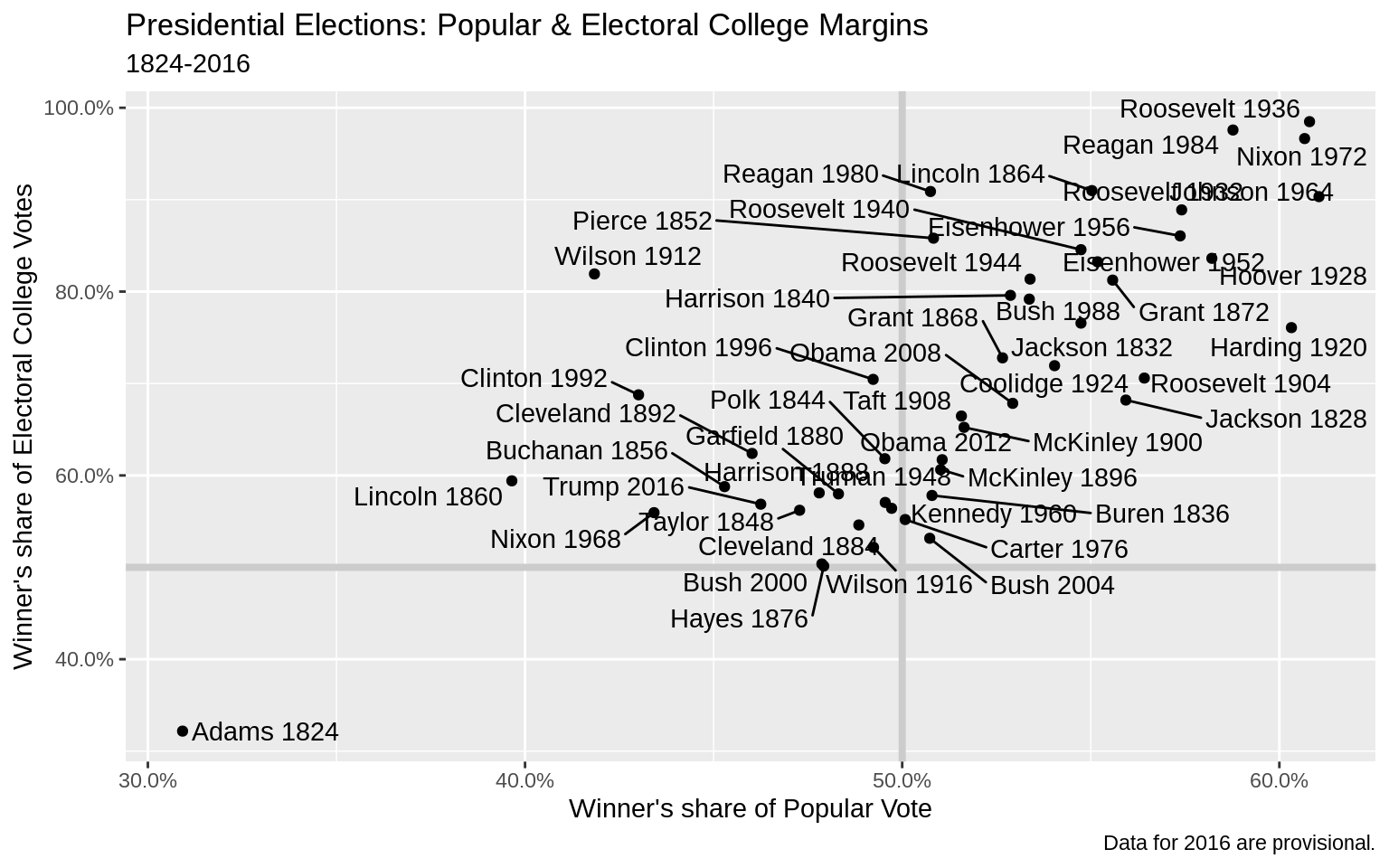 ### Label Outliers
p <- ggplot(data = by_country,
            mapping = aes(x = gdp_mean, y = health_mean))

p + geom_point() +
  geom_text_repel(data = subset(by_country, gdp_mean > 25000),
                  mapping = aes(label = country))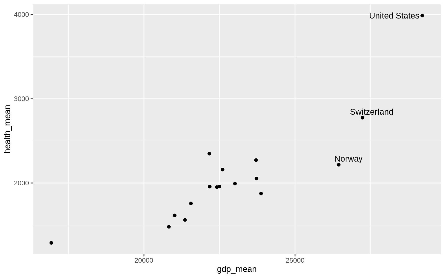
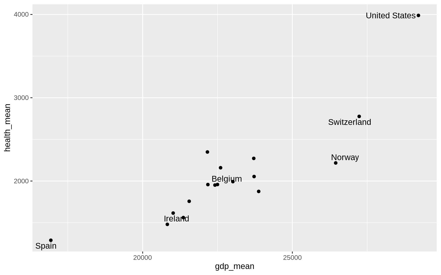
p <- ggplot(data = by_country,
            mapping = aes(x = gdp_mean, y = health_mean))

p + geom_point() +
  geom_text_repel(
    data = subset(
      by_country,
      gdp_mean > 25000 | health_mean < 1500 |
        country %in% "Belgium"
    ),
    mapping = aes(label = country)
  )
organdata$ind <- organdata$ccode %in% c("Ita", "Spa") &
  organdata$year > 1998

p <- ggplot(data = organdata,
            mapping = aes(x = roads,
                          y = donors, color = ind))
p + geom_point() +
  geom_text_repel(data = subset(organdata, ind),
                  mapping = aes(label = ccode)) +
  guides(label = FALSE, color = FALSE)
## Warning: Removed 34 rows containing missing values (geom_point).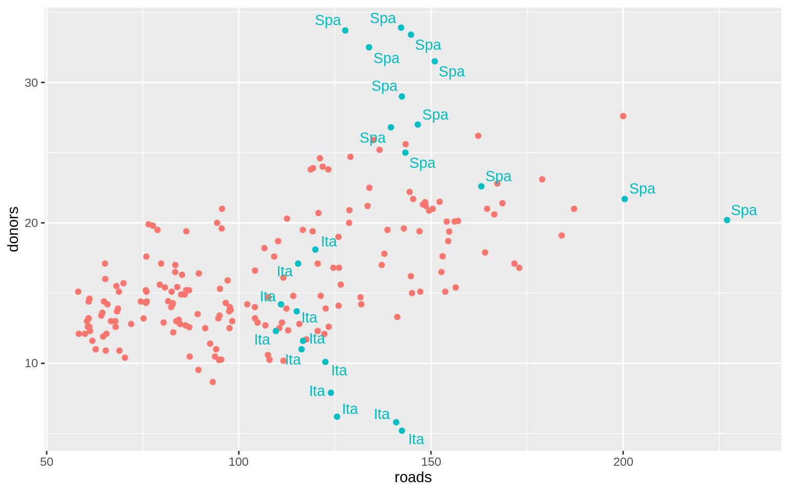
Write and Draw in the Plot Area
p <- ggplot(data = organdata, mapping = aes(x = roads, y = donors))
p + geom_point() + annotate(
  geom = "text",
  x = 91,
  y = 33,
  label = "A surprisingly high \n recovery rate.",
  hjust = 0
)
## Warning: Removed 34 rows containing missing values (geom_point).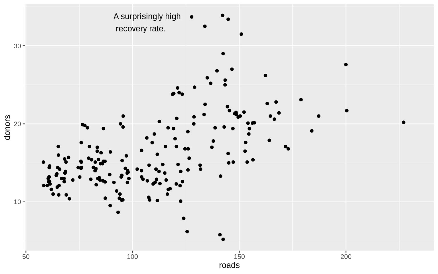
p <- ggplot(data = organdata,
            mapping = aes(x = roads, y = donors))
p + geom_point() +
  annotate(
    geom = "rect",
    xmin = 125,
    xmax = 155,
    ymin = 30,
    ymax = 35,
    fill = "red",
    alpha = 0.2
  ) +
  annotate(
    geom = "text",
    x = 157,
    y = 33,
    label = "A surprisingly high \n recovery rate.",
    hjust = 0
  )
## Warning: Removed 34 rows containing missing values (geom_point).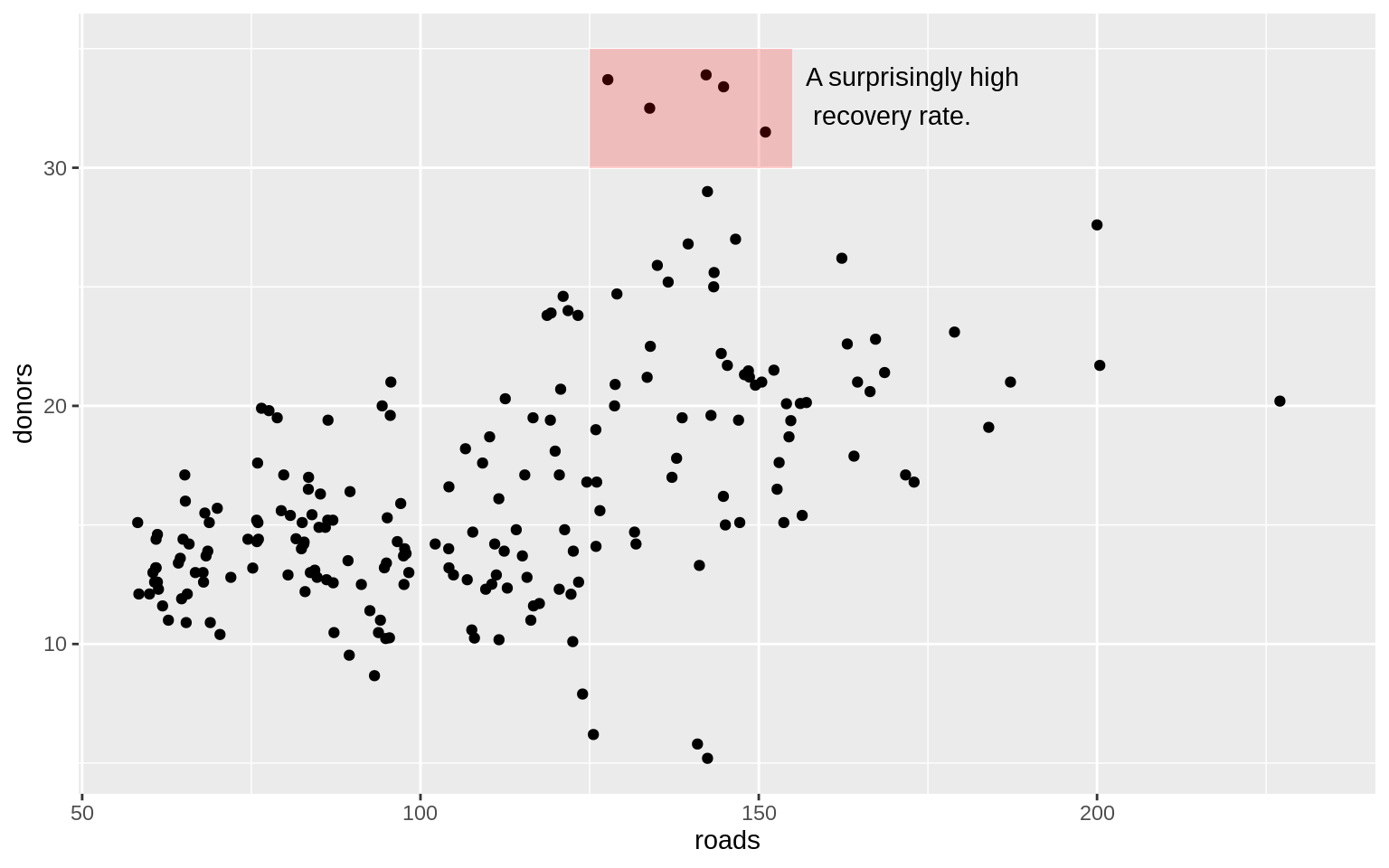
Scales, Guides, and Themes
p <- ggplot(data = organdata,
            mapping = aes(x = roads,
                          y = donors,
                          color = world))
p + geom_point()
## Warning: Removed 34 rows containing missing values (geom_point).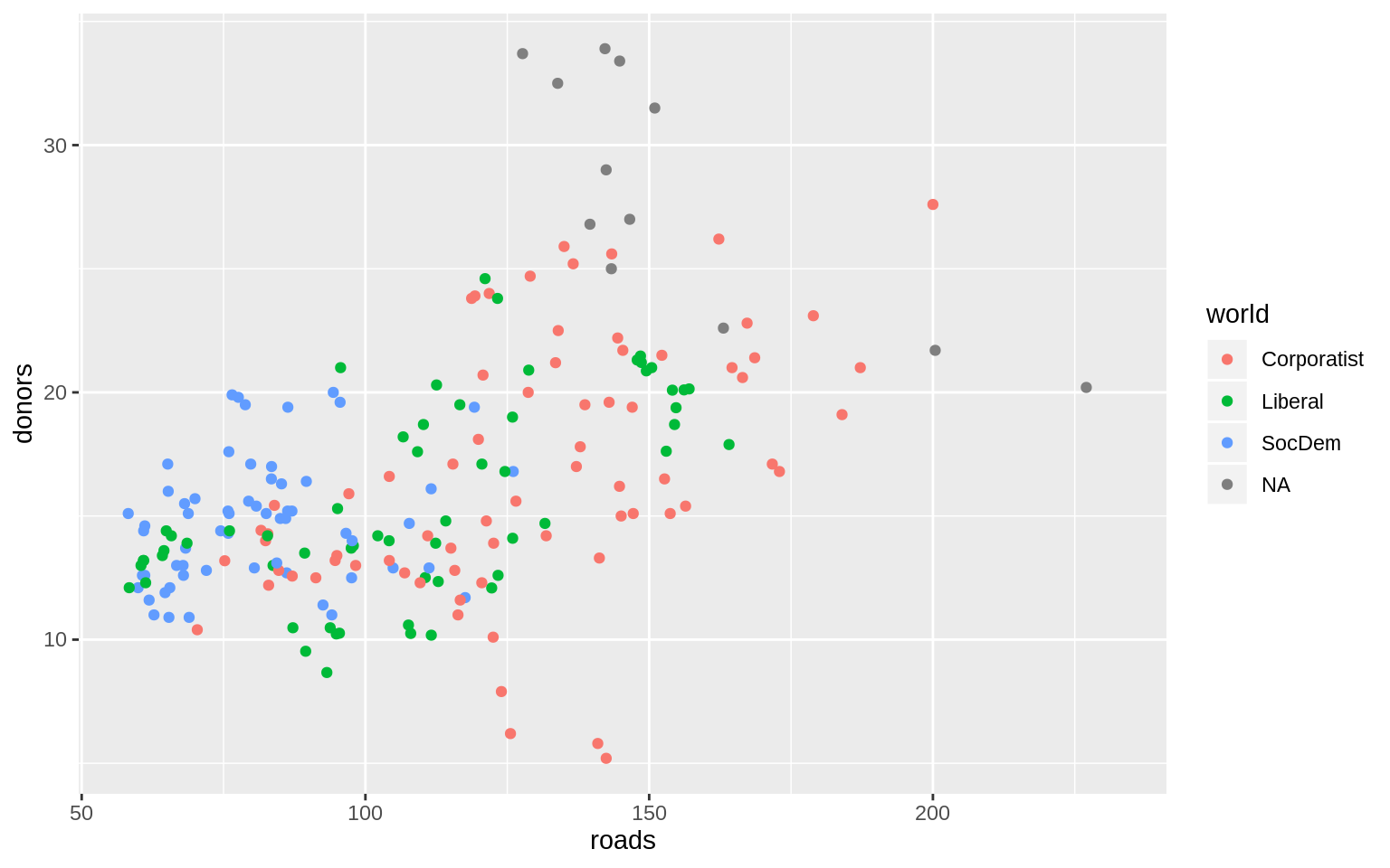
p <- ggplot(data = organdata,
            mapping = aes(x = roads,
                          y = donors,
                          color = world))
p + geom_point() + scale_x_log10() + scale_y_continuous(breaks = c(5,
                                                                   15, 25),
                                                        labels = c("Five", "Fifteen", "Twenty Five"))
## Warning: Removed 34 rows containing missing values (geom_point).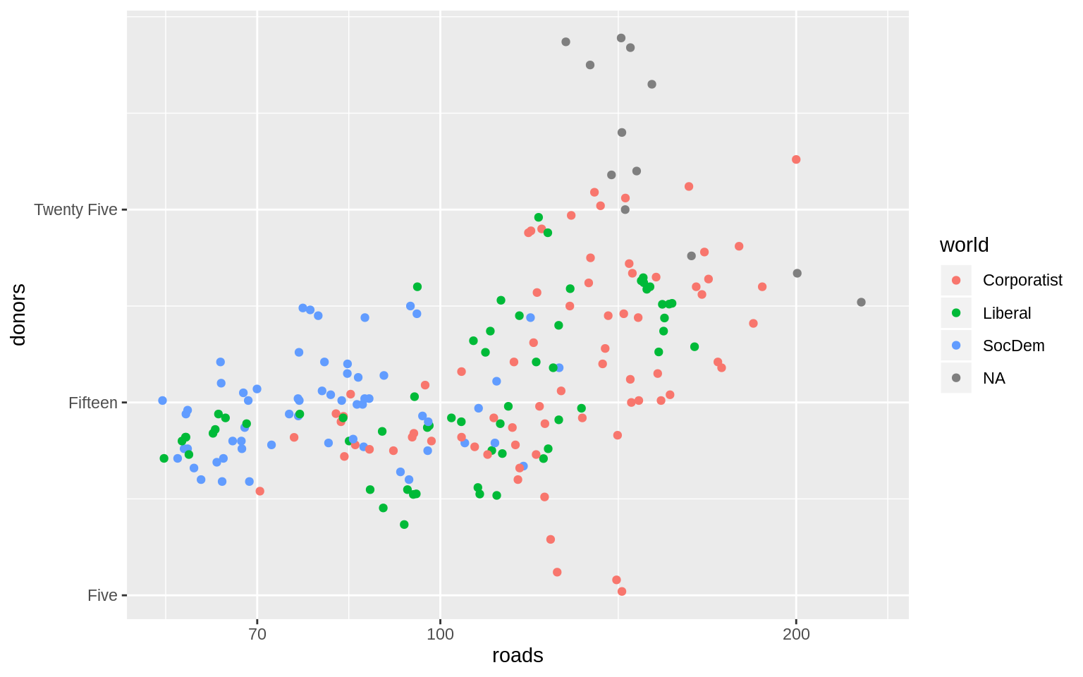
p <- ggplot(data = organdata,
            mapping = aes(x = roads, y = donors,
                          color = world))
p + geom_point() + scale_color_discrete(labels = c("Corporatist",
                                                   "Liberal", "Social Democratic", "Unclassified")) +
  labs(x = "Road Deaths",
       y = "Donor Procurement", color = "Welfare State")
## Warning: Removed 34 rows containing missing values (geom_point).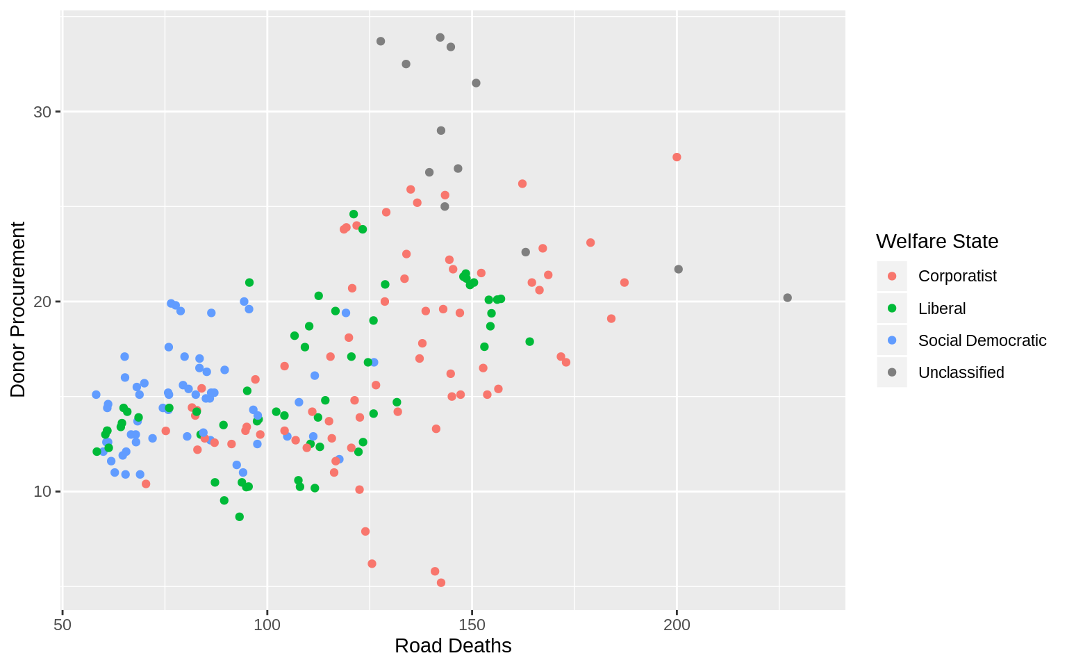
p <- ggplot(data = organdata,
            mapping = aes(x = roads, y = donors,
                          color = world))
p + geom_point() + labs(x = "Road Deaths", y = "Donor Procurement") +
  guides(color = FALSE)
## Warning: Removed 34 rows containing missing values (geom_point).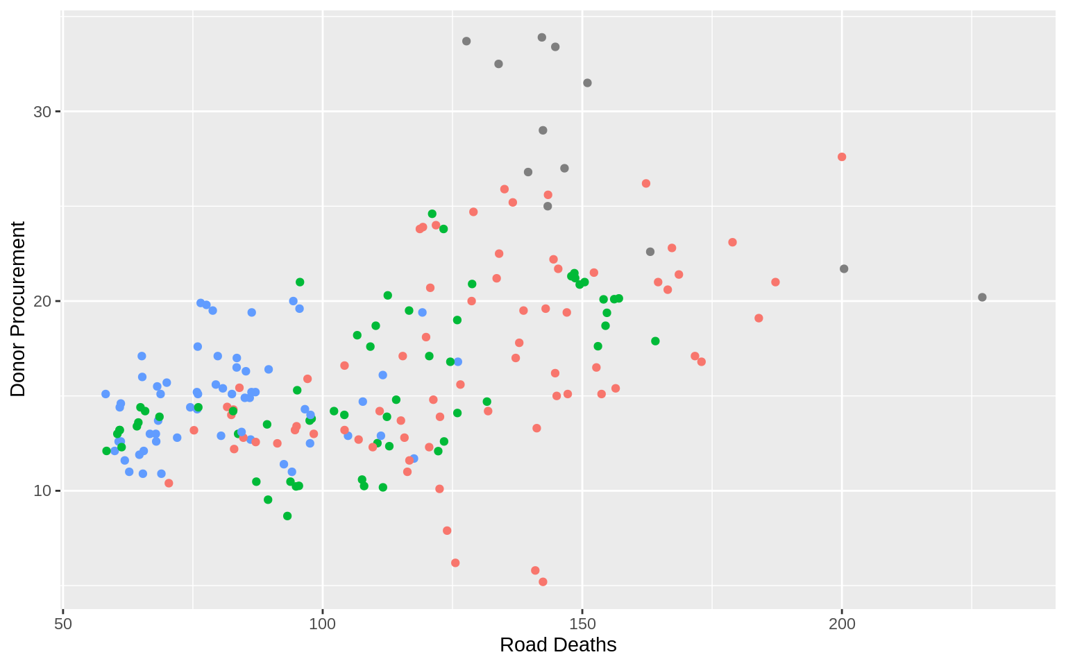
Yihong WANG
Wayfaring Stranger