Data Visualization Chapter 2-4
Chapter 2
geom_point
p <- ggplot(data = gapminder,
            mapping = aes(x = gdpPercap, y = lifeExp))
p + geom_point()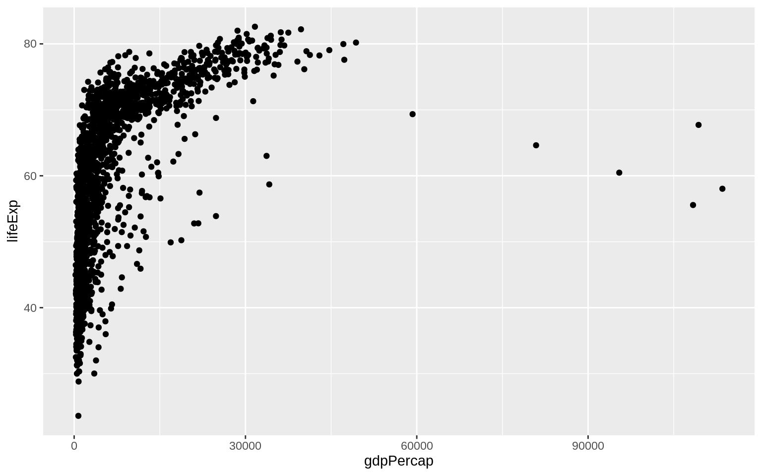
Chapter 3
geom_smooth
## `geom_smooth()` using method = 'gam' and formula 'y ~ s(x, bs = "cs")'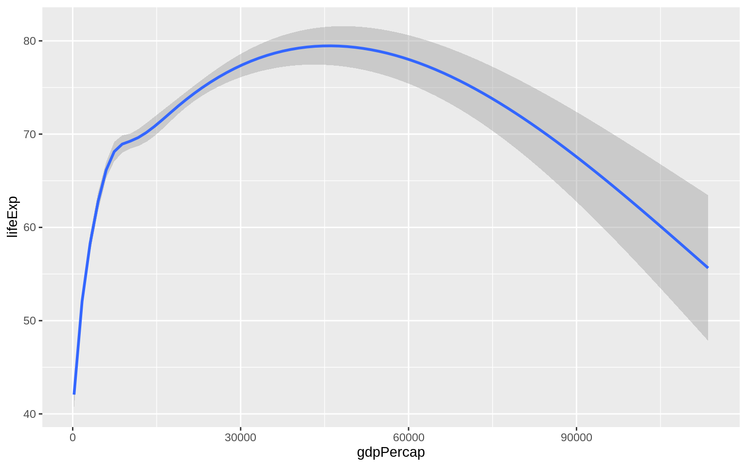
p <- ggplot(data = gapminder, mapping = aes(x = gdpPercap, y = lifeExp))
p + geom_point() + geom_smooth()
## `geom_smooth()` using method = 'gam' and formula 'y ~ s(x, bs = "cs")'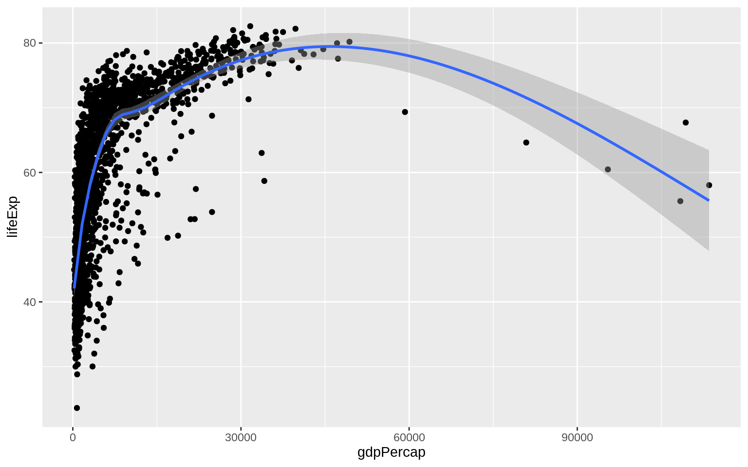
scale_x_log10
p <- ggplot(data = gapminder, mapping = aes(x = gdpPercap, y = lifeExp))
p + geom_point() + geom_smooth(method = "gam") + scale_x_log10()
scales::dollar
p <- ggplot(data = gapminder, mapping = aes(x = gdpPercap, y = lifeExp))
p + geom_point() +
geom_smooth(method = "gam") +
scale_x_log10(labels = scales::dollar)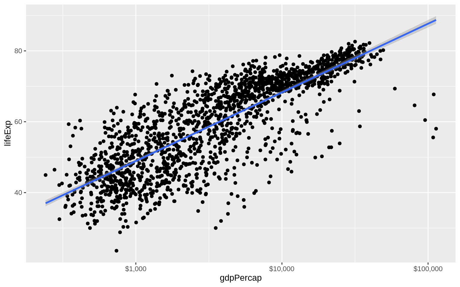
Wrong way to set color
p <- ggplot(data = gapminder, mapping = aes(x = gdpPercap, y = lifeExp,
color = "purple"))
p + geom_point() + geom_smooth(method = "loess") + scale_x_log10()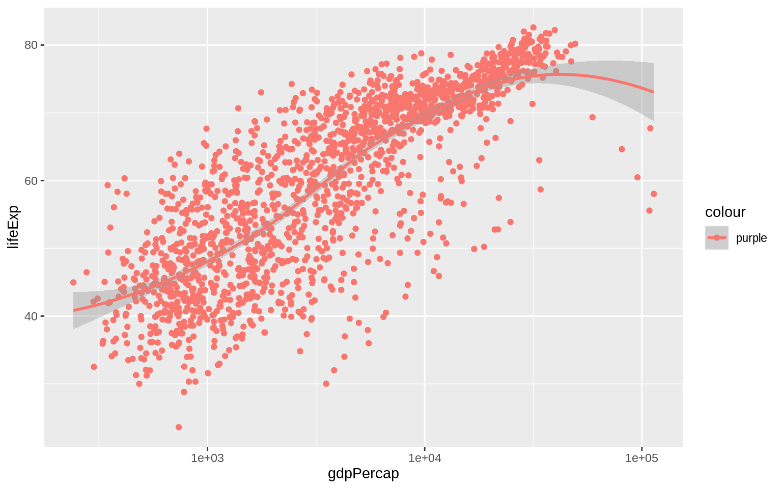
The aes() function is for mappings only. Do not use it to change properties to a particular value. If we want to set a property, we do it in the geom_ we are using, and outside the mapping =aes(...)step.
p <- ggplot(data = gapminder, mapping = aes(x = gdpPercap, y = lifeExp))
p + geom_point(color = "purple") + geom_smooth(method = "loess") + scale_x_log10()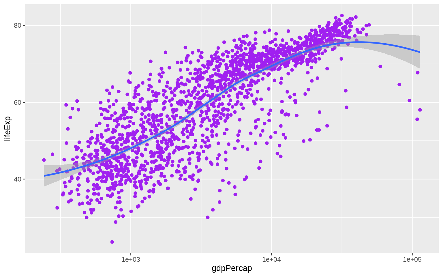 The various
 geom_ functions can take many other arguments that will affect how the plot looks but do not involve mapping variables to aesthetic elements.
“alpha” is an aesthetic property that points (and some other plot elements) have, and to which variables can be mapped. It controls how transparent the object will appear when drawn. It’s measured on a scale of zero to one.
p <- ggplot(data = gapminder, mapping = aes(x = gdpPercap, y = lifeExp))
p + geom_point(alpha = 0.3) + geom_smooth(color = "orange", se = FALSE,
                                          size = 8, method = "lm") + scale_x_log10()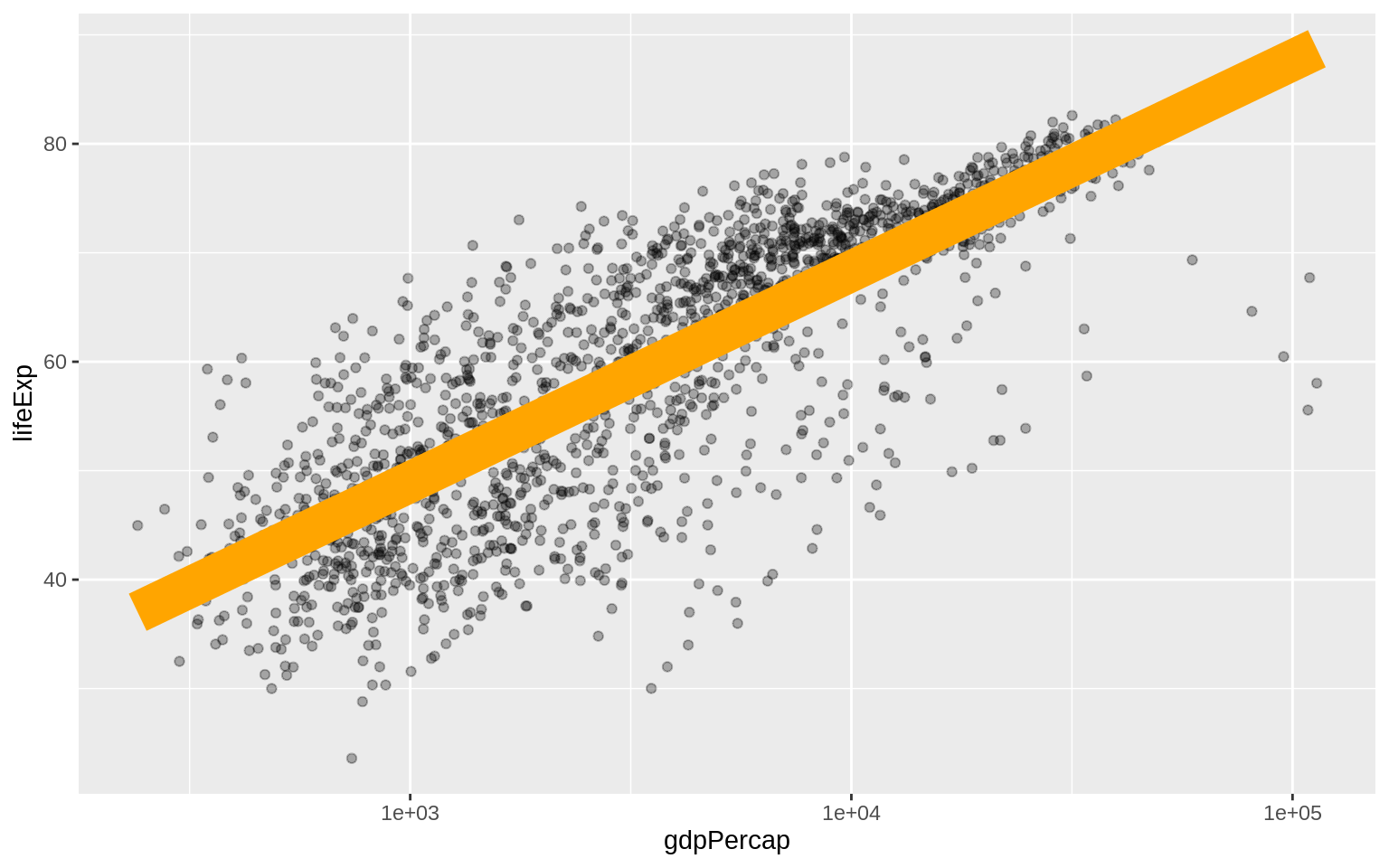
p <- ggplot(data = gapminder, mapping = aes(x = gdpPercap, y=lifeExp))
p + geom_point(alpha = 0.3) +
  geom_smooth(method = "gam") +
  scale_x_log10(labels = scales::dollar) +
  labs(x = "GDP Per Capita", y = "Life Expectancy in Years",
       title = "Economic Growth and Life Expectancy",
       subtitle = "Data points are country-years",
       caption = "Source: Gapminder.")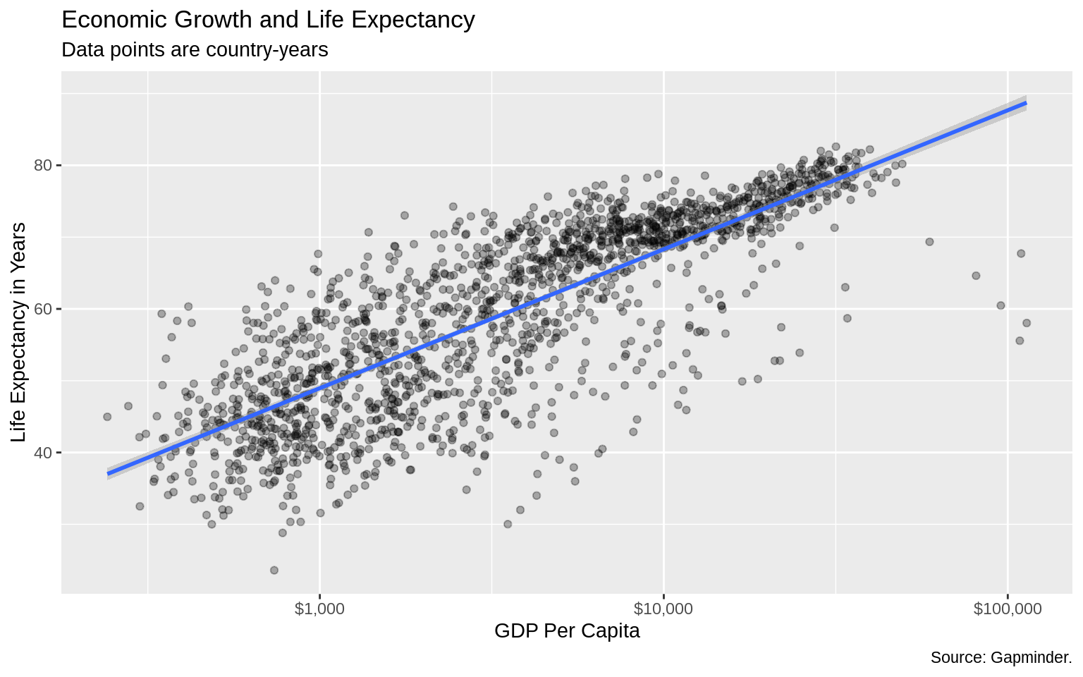
p <- ggplot(data = gapminder, mapping = aes(x = gdpPercap, y = lifeExp,
color = continent))
p + geom_point() + geom_smooth(method = "loess") + scale_x_log10()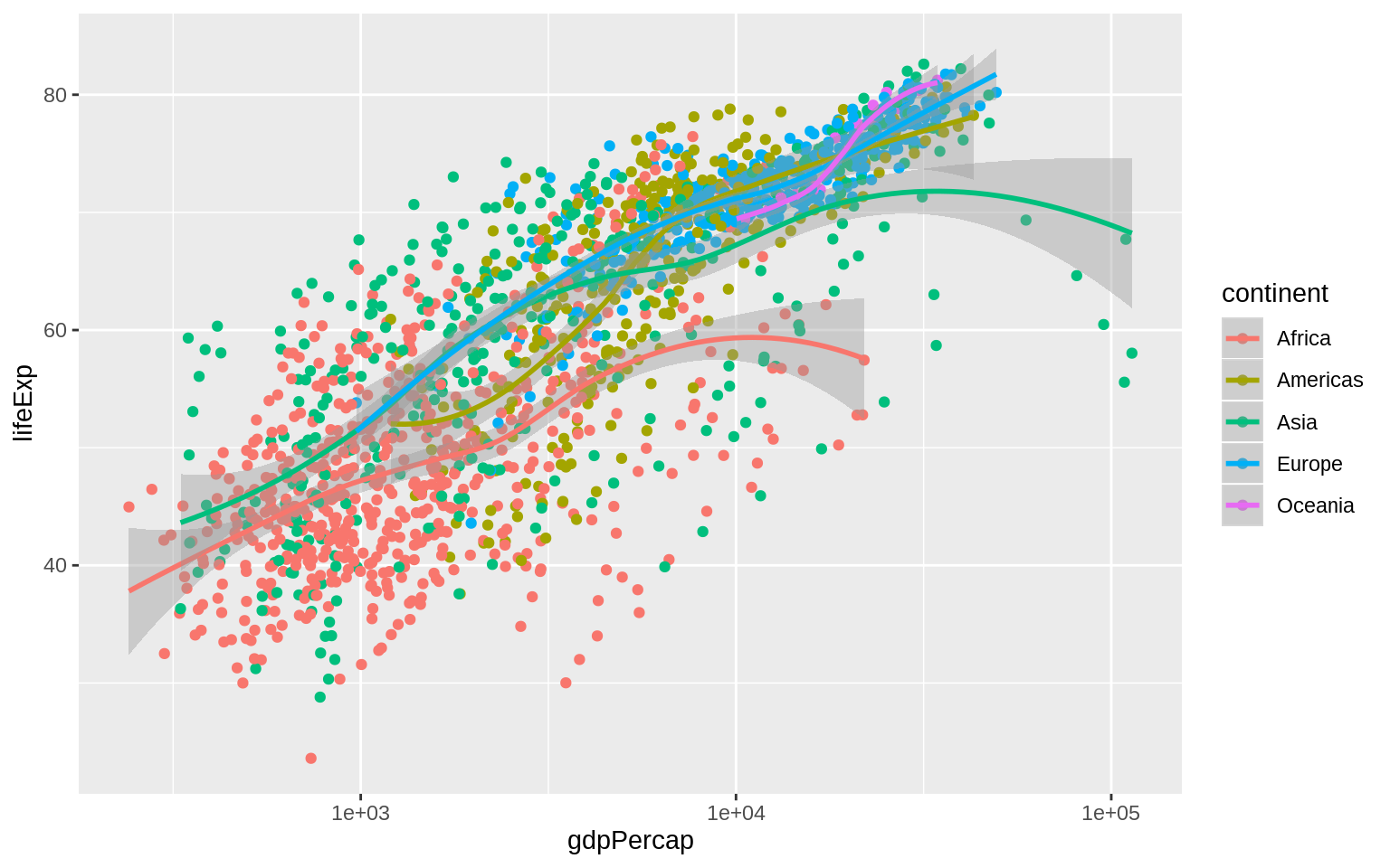 The color of the standard error ribbon is controlled by the fill aesthetic.
p <- ggplot(data = gapminder, mapping = aes(x = gdpPercap, y = lifeExp,
                                            color = continent, fill = continent))
p + geom_point() + geom_smooth(method = "loess") + scale_x_log10()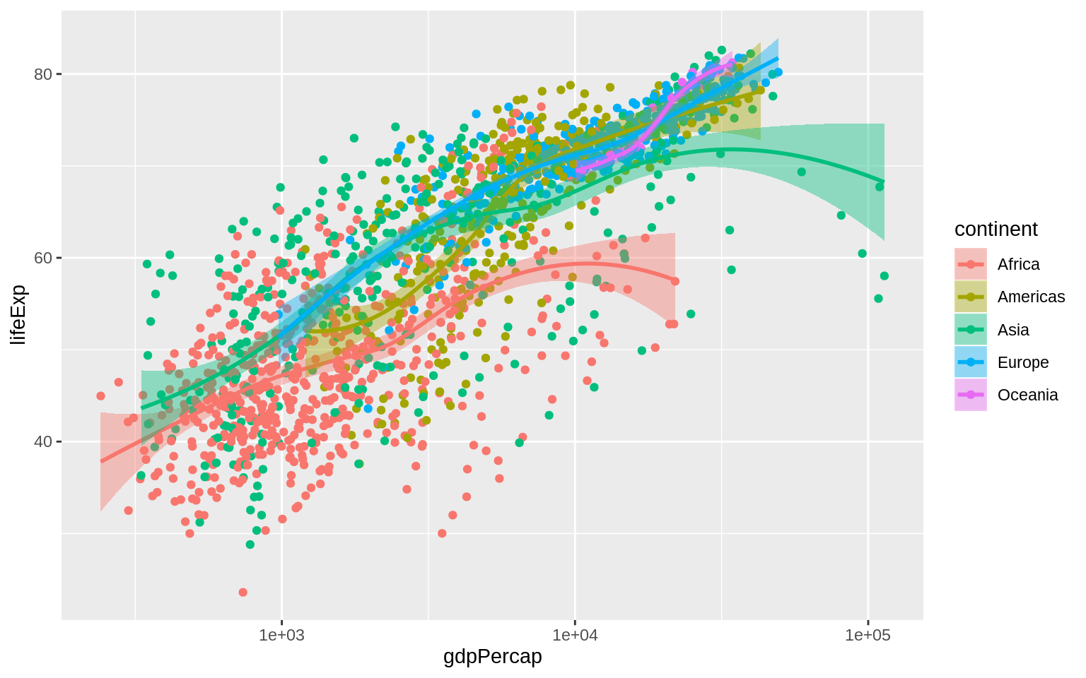
Aesthetics Can Be Mapped per Geom
p <- ggplot(data = gapminder, mapping = aes(x = gdpPercap, y = lifeExp))
p + geom_point(mapping = aes(color = factor(year))) +
  geom_smooth(method = "loess") +
  scale_x_log10()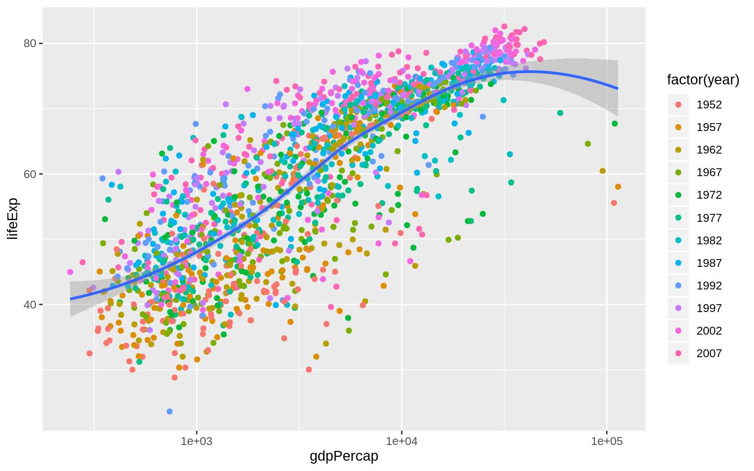
Order doesn’t matter!!!
Besides scale_x_log10(), you can try scale_x_sqrt() and scale_x_reverse()
p <- ggplot(data = gapminder, mapping = aes(x = pop, y = lifeExp))
p + geom_smooth(method = "loess") +
  geom_point(mapping = aes(color = continent)) +
  scale_x_reverse(labels = scales::number)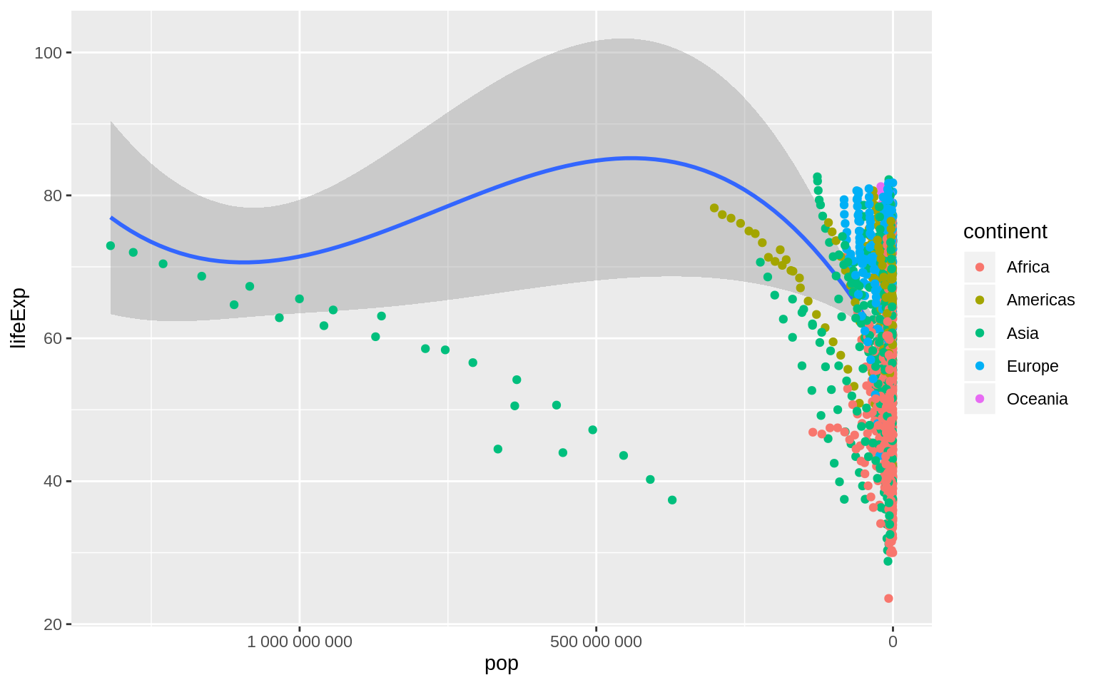
p <- ggplot(data = gapminder, mapping = aes(x = gdpPercap, y = lifeExp))
p + geom_point(mapping = aes(color = log(pop))) + scale_x_log10()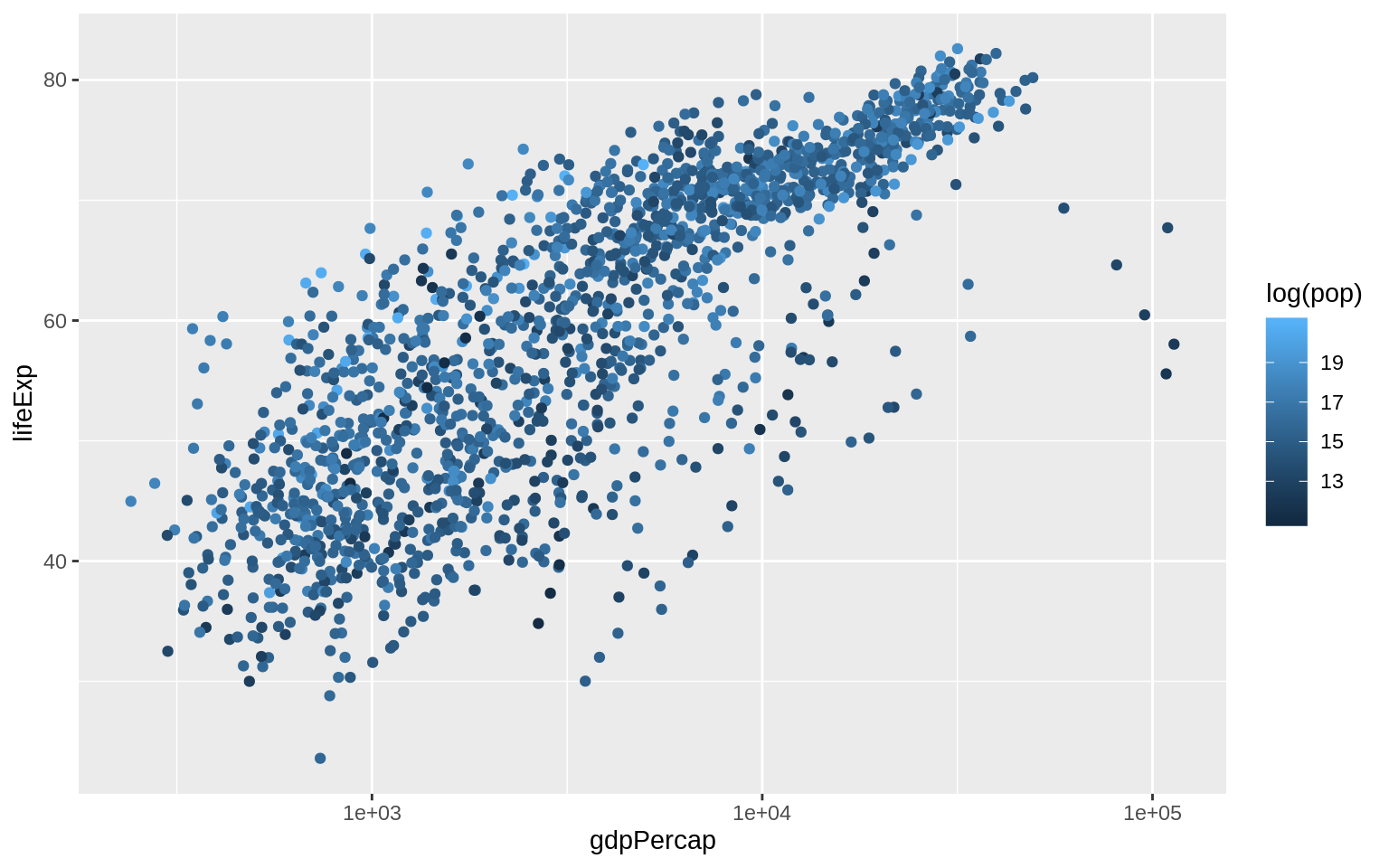
Save plots
p_out <-  p + geom_point() + geom_smooth(method = "loess") + scale_x_log10()
ggsave("my_figure.pdf", plot = p_out)
Chapter 4
Group data and the “Group” Aesthetic
p <- ggplot(data = gapminder, mapping = aes(x = year, y = gdpPercap))
p + geom_line()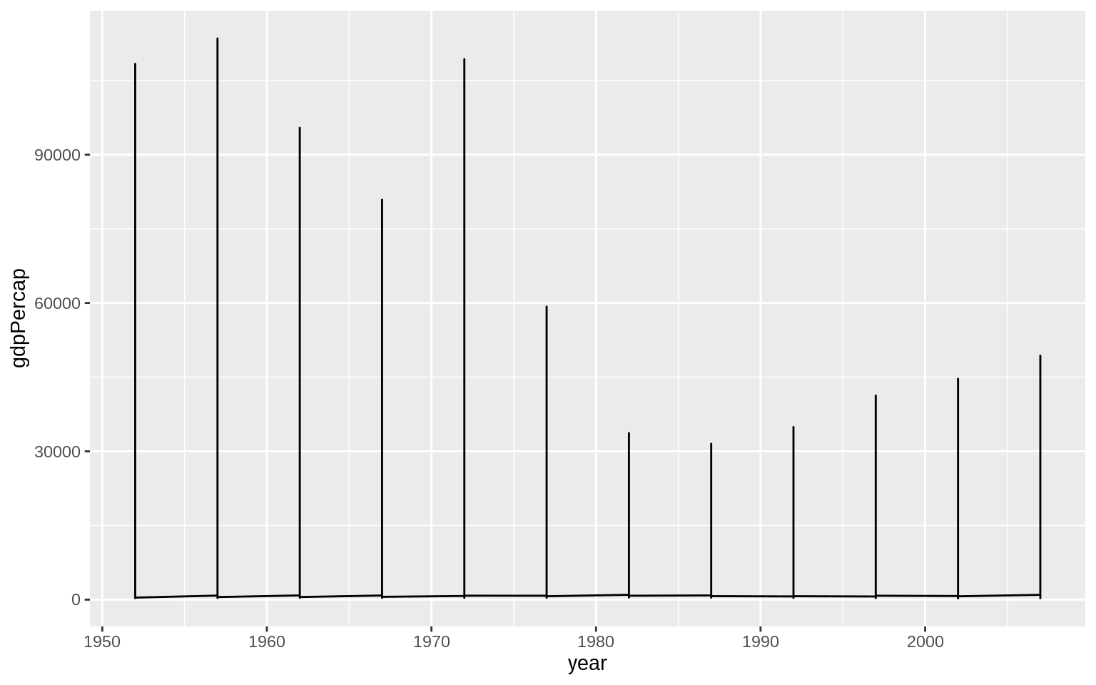 use the
 group aesthetic to tell ggplot explicitly about this country-level structure
p <- ggplot(data = gapminder, mapping = aes(x = year, y = gdpPercap))
p + geom_line(aes(group = country))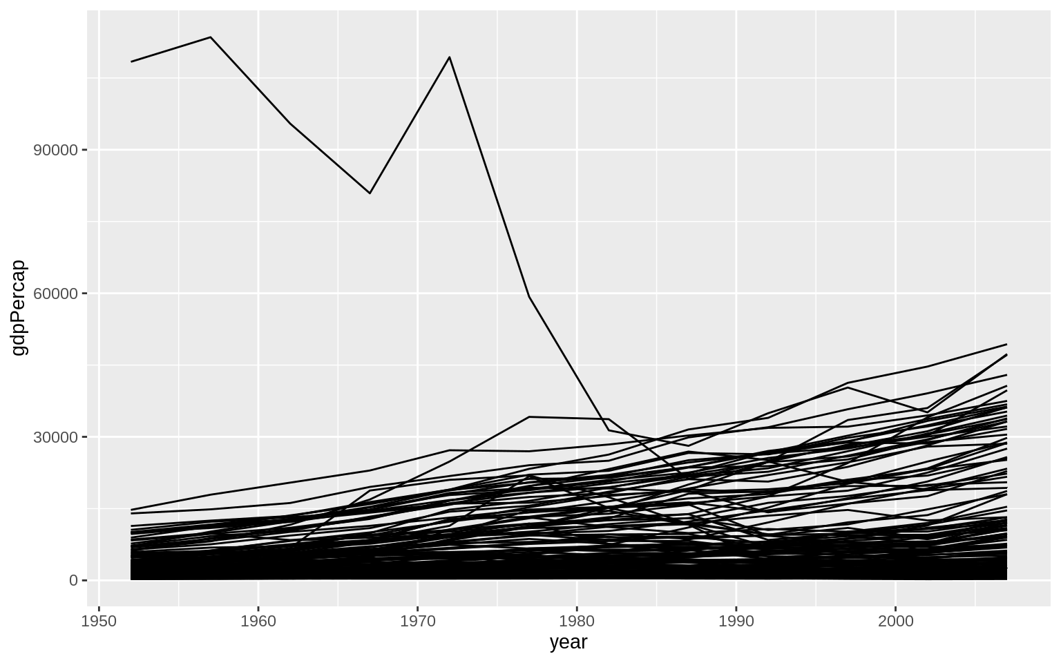
Facet to make small multiples
use facet_wrap() to split our plot by continent.
p <- ggplot(data = gapminder, mapping = aes(x = year, y = gdpPercap))
p + geom_line(aes(group = country)) + facet_wrap(~continent)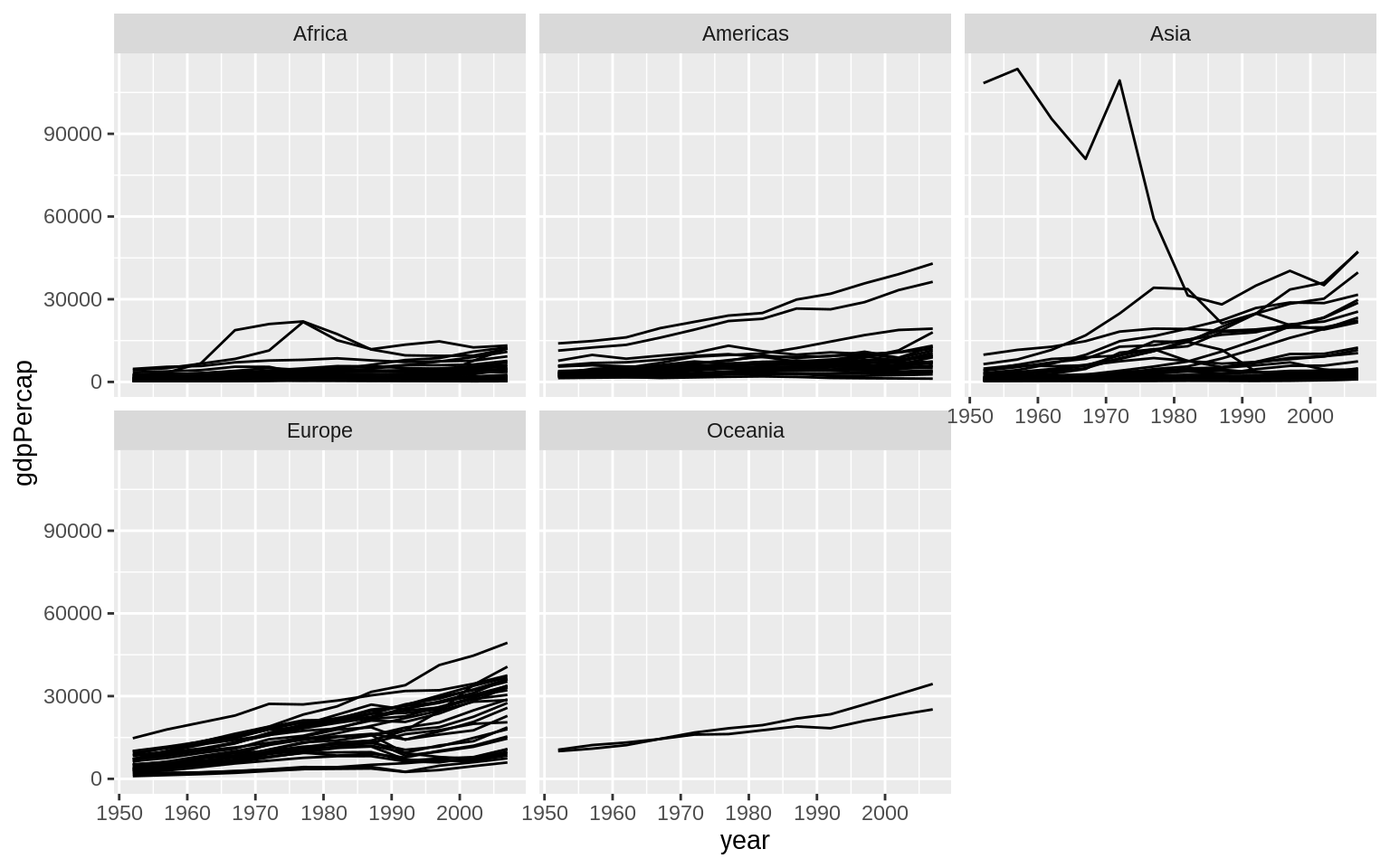 Add another enhancements
p <- ggplot(data = gapminder, mapping = aes(x = year, y = gdpPercap))
p + geom_line(color="gray70", aes(group = country)) +
  geom_smooth(size= 1.1, method = "loess", se = FALSE) +
  scale_y_log10(labels=scales::dollar) +
  facet_wrap(~continent , ncol = 5) +
  labs(x = "Year",
       y = "GDP per capita on Five Continents")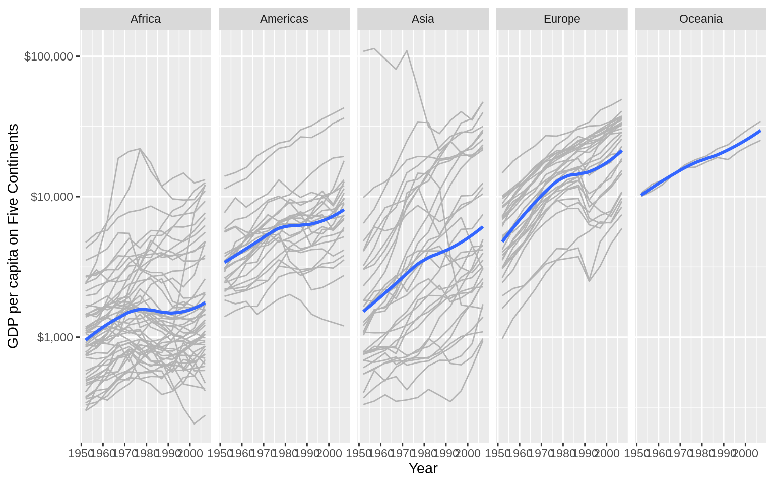
Use facet_grid
p <- ggplot(data = gss_sm, mapping = aes(x = age, y = childs))
p + geom_point(alpha = 0.2) +
  geom_smooth() +
  facet_grid(sex ~ race)
## `geom_smooth()` using method = 'gam' and formula 'y ~ s(x, bs = "cs")'## Warning: Removed 18 rows containing non-finite values (stat_smooth).## Warning: Removed 18 rows containing missing values (geom_point).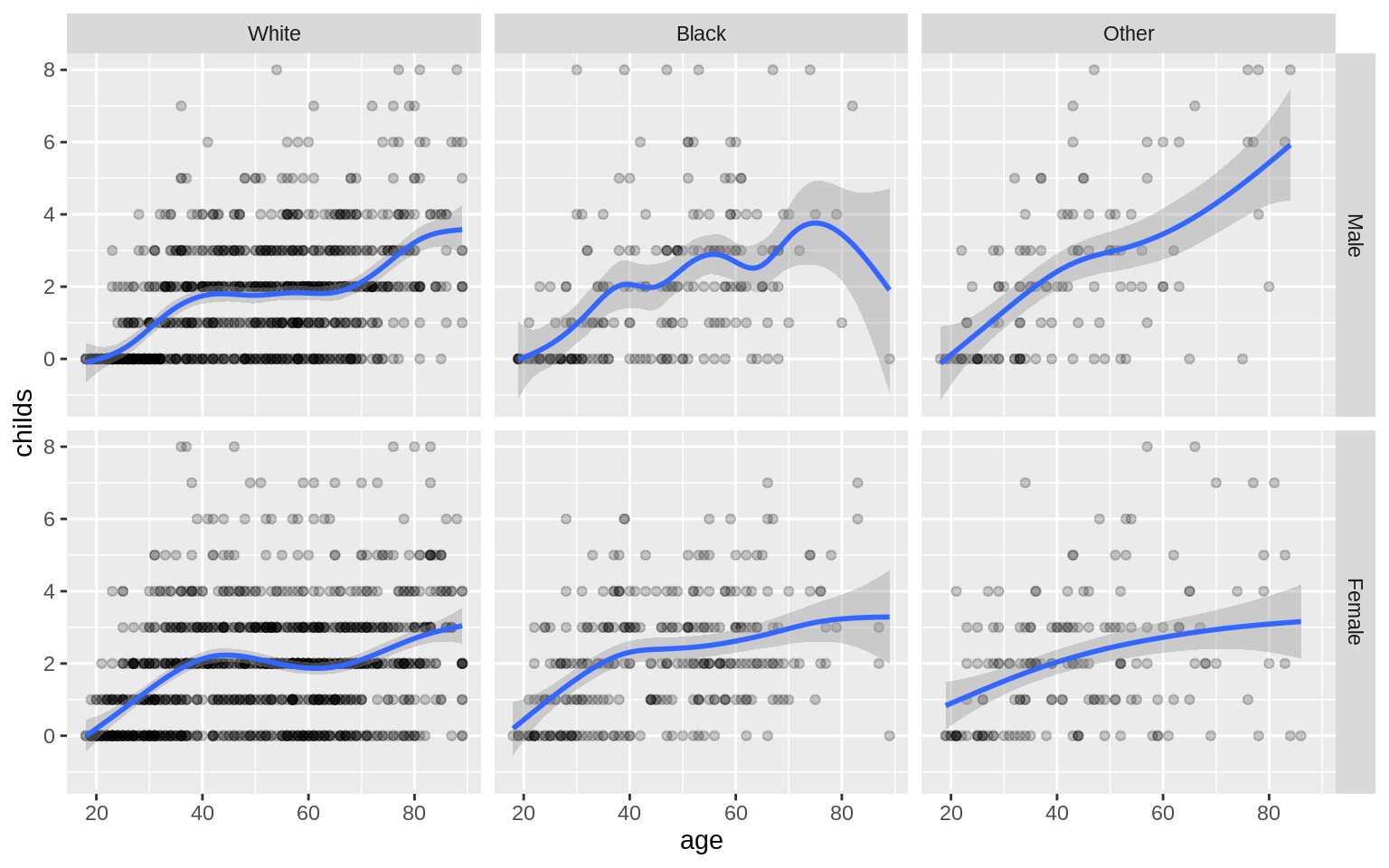
p <- ggplot(data = gss_sm, mapping = aes(x = age, y = childs))
p + geom_point(alpha = 0.2) +
  geom_smooth() +
  facet_grid(sex ~ race + degree)
## `geom_smooth()` using method = 'loess' and formula 'y ~ x'## Warning: Removed 18 rows containing non-finite values (stat_smooth).## Warning in simpleLoess(y, x, w, span, degree = degree, parametric =
## parametric, : span too small. fewer data values than degrees of freedom.## Warning in simpleLoess(y, x, w, span, degree = degree, parametric =
## parametric, : pseudoinverse used at 62.87## Warning in simpleLoess(y, x, w, span, degree = degree, parametric =
## parametric, : neighborhood radius 2.13## Warning in simpleLoess(y, x, w, span, degree = degree, parametric =
## parametric, : reciprocal condition number 0## Warning in simpleLoess(y, x, w, span, degree = degree, parametric =
## parametric, : There are other near singularities as well. 582.26## Warning in predLoess(object$y, object$x, newx = if
## (is.null(newdata)) object$x else if (is.data.frame(newdata))
## as.matrix(model.frame(delete.response(terms(object)), : span too small.
## fewer data values than degrees of freedom.## Warning in predLoess(object$y, object$x, newx = if
## (is.null(newdata)) object$x else if (is.data.frame(newdata))
## as.matrix(model.frame(delete.response(terms(object)), : pseudoinverse used
## at 62.87## Warning in predLoess(object$y, object$x, newx = if
## (is.null(newdata)) object$x else if (is.data.frame(newdata))
## as.matrix(model.frame(delete.response(terms(object)), : neighborhood radius
## 2.13## Warning in predLoess(object$y, object$x, newx = if
## (is.null(newdata)) object$x else if (is.data.frame(newdata))
## as.matrix(model.frame(delete.response(terms(object)), : reciprocal
## condition number 0## Warning in predLoess(object$y, object$x, newx = if
## (is.null(newdata)) object$x else if (is.data.frame(newdata))
## as.matrix(model.frame(delete.response(terms(object)), : There are other
## near singularities as well. 582.26## Warning: Removed 18 rows containing missing values (geom_point).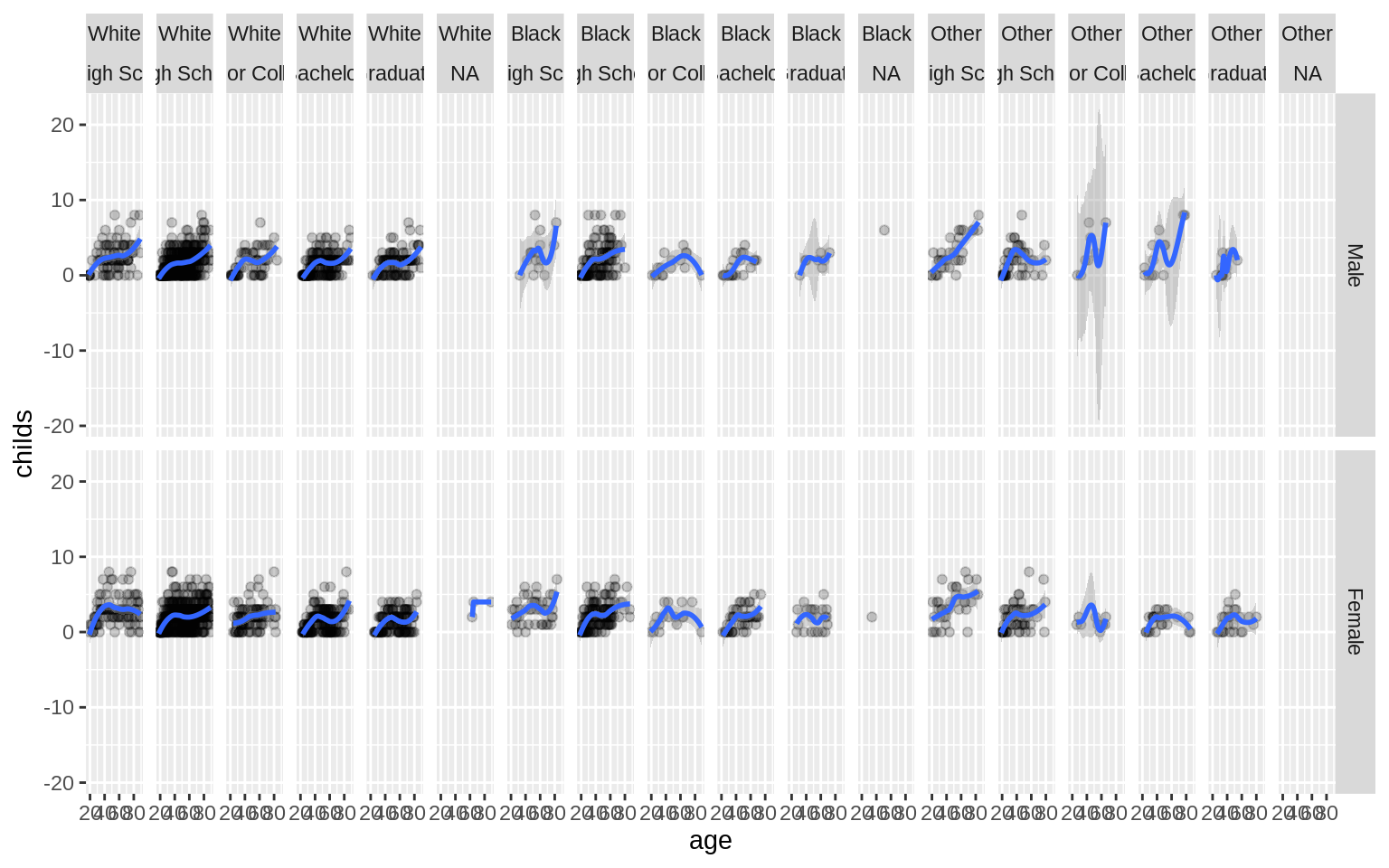
Geoms can transform data
p <- ggplot(data = gss_sm, mapping = aes(x = bigregion))
p + geom_bar()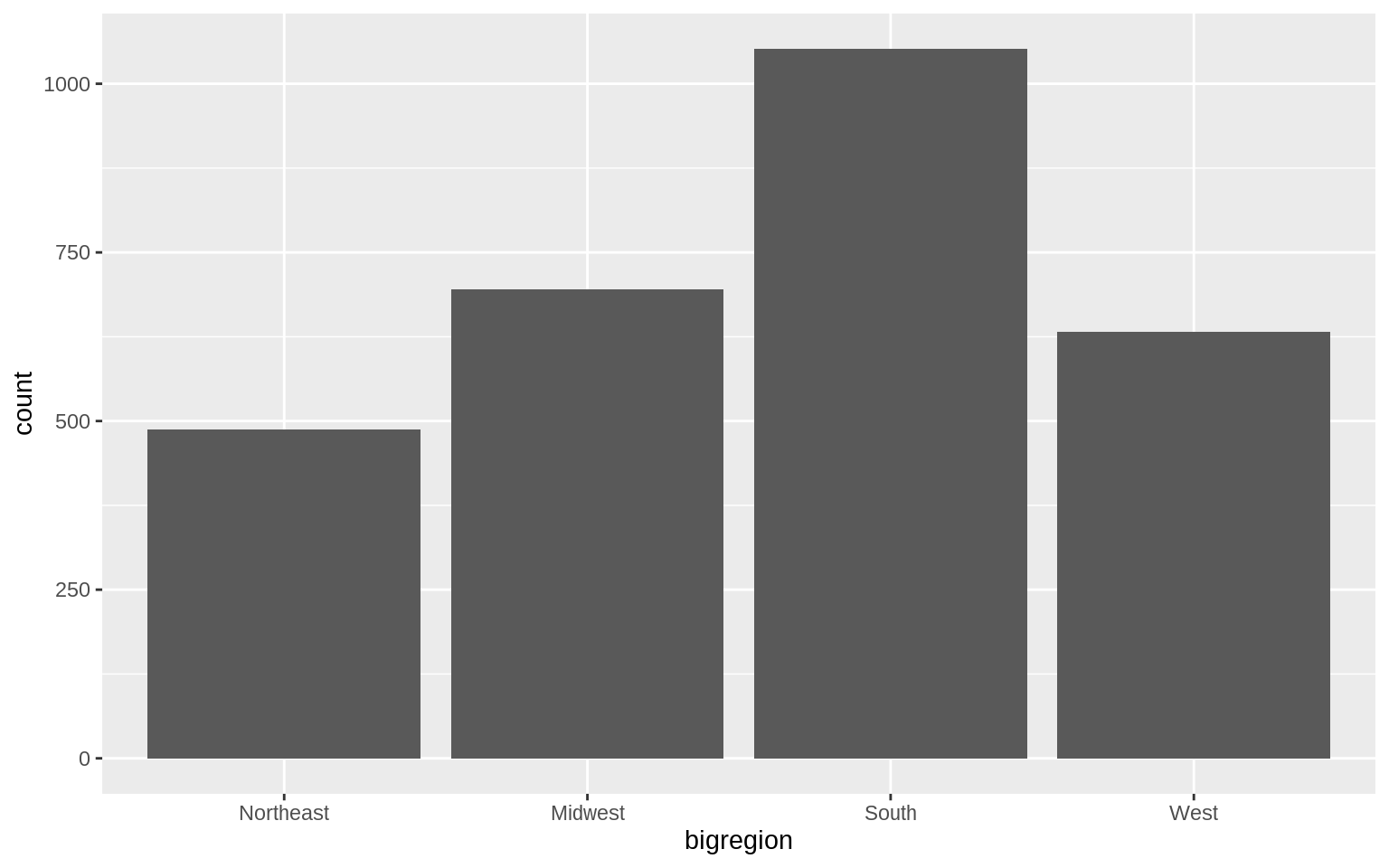
geom_bar called the default stat_ function associated with it,stat_count().
p <- ggplot(data = gss_sm, mapping = aes(x = bigregion))
p + geom_bar(mapping = aes(y = ..prop..))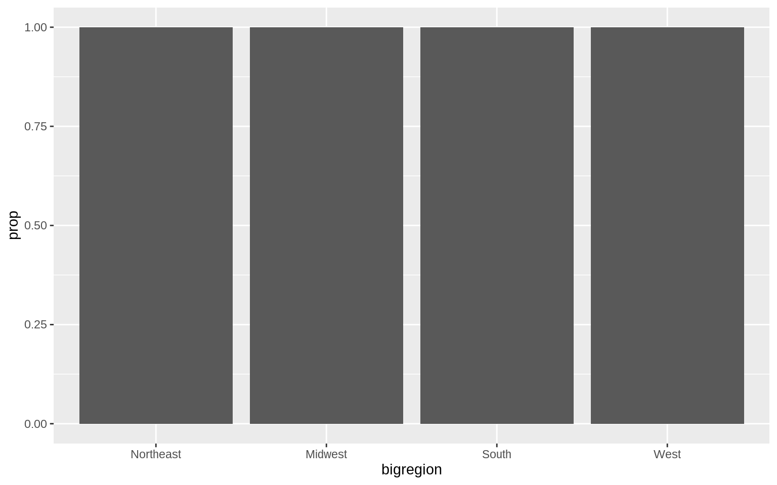
p <- ggplot(data = gss_sm, mapping = aes(x = bigregion))
p + geom_bar(mapping = aes(y = ..prop.., group = 1))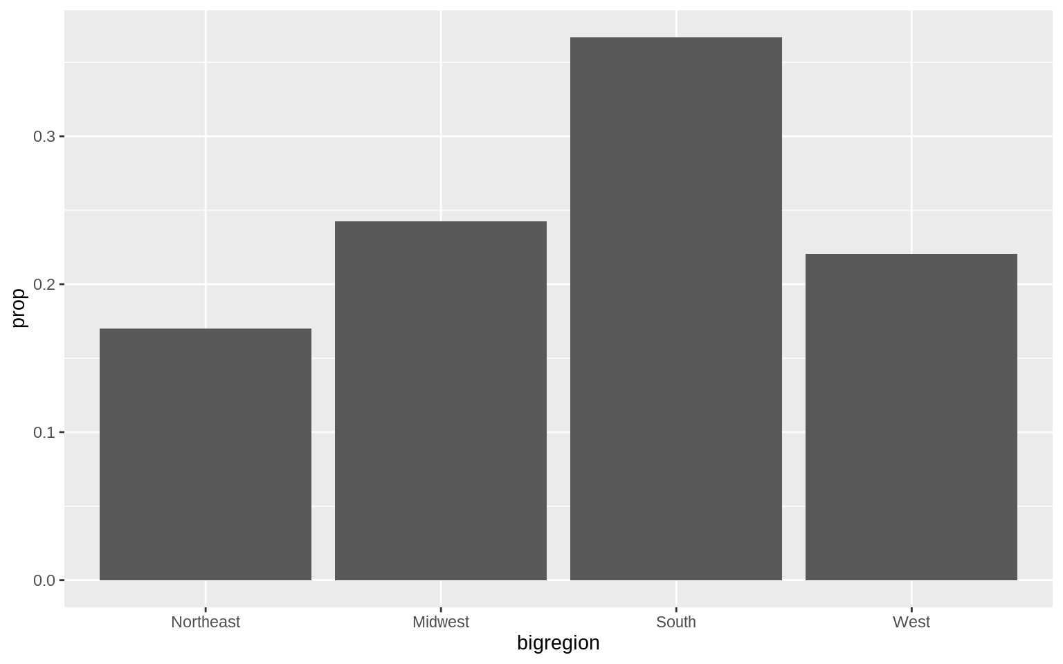
table(gss_sm$religion)##
## Protestant Catholic Jewish None Other
## 1371 649 51 619 159p <- ggplot(data = gss_sm, mapping = aes(x = religion, color = religion))
p + geom_bar()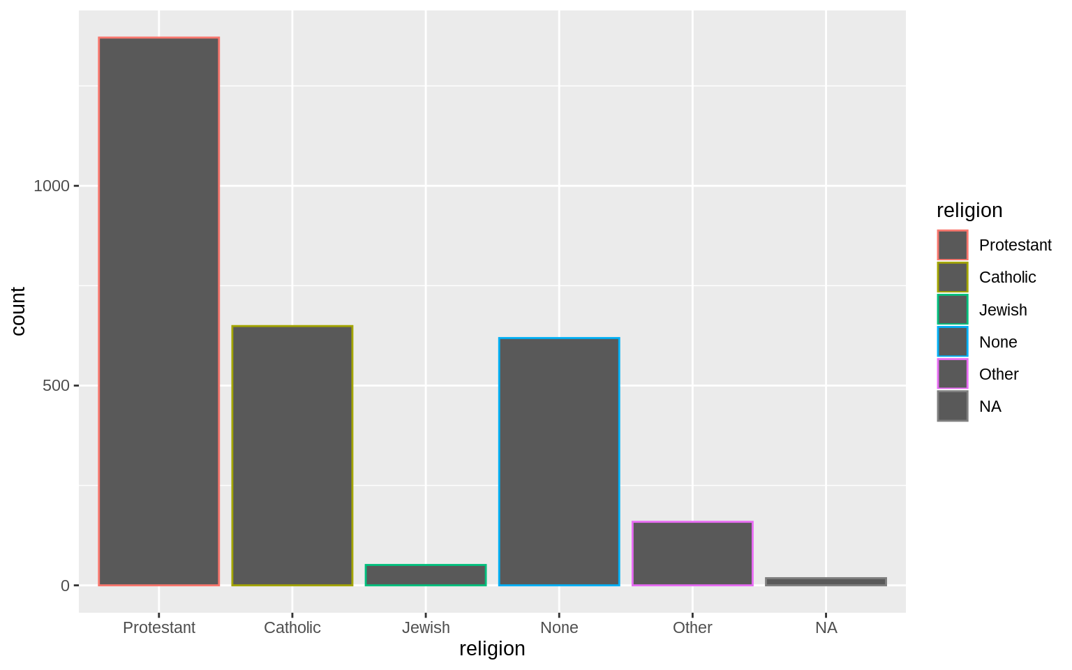
p <- ggplot(data = gss_sm, mapping = aes(x = religion, fill = religion))
p + geom_bar() + guides(fill = FALSE)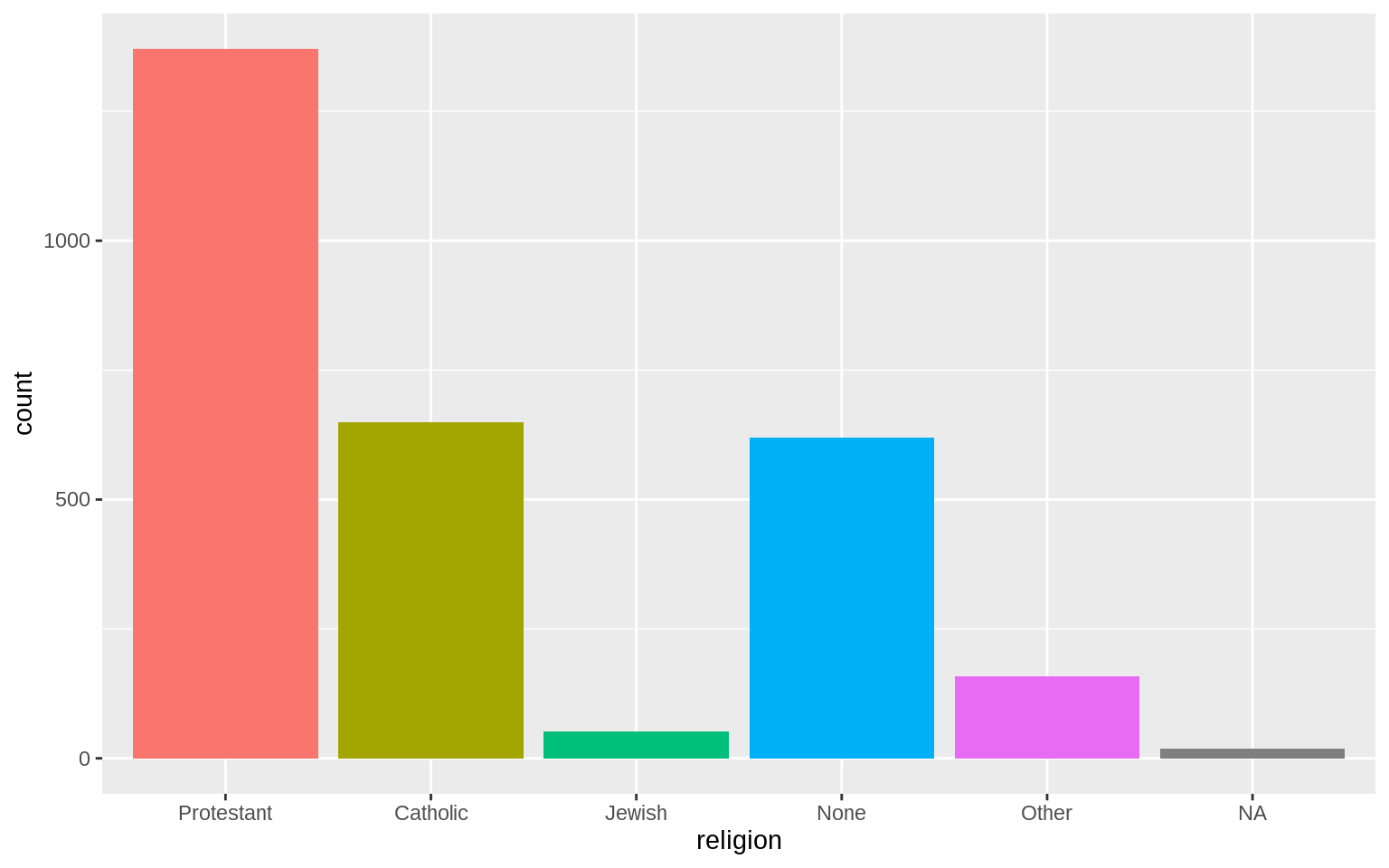
p + geom_bar()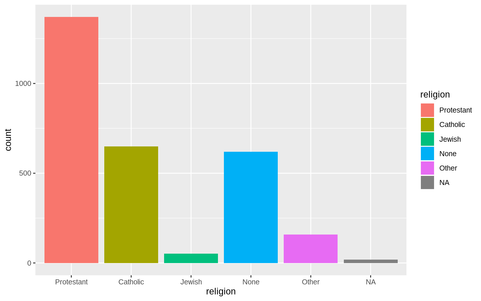
p <- ggplot(data = gss_sm, mapping = aes(x = bigregion, fill = religion))
p + geom_bar()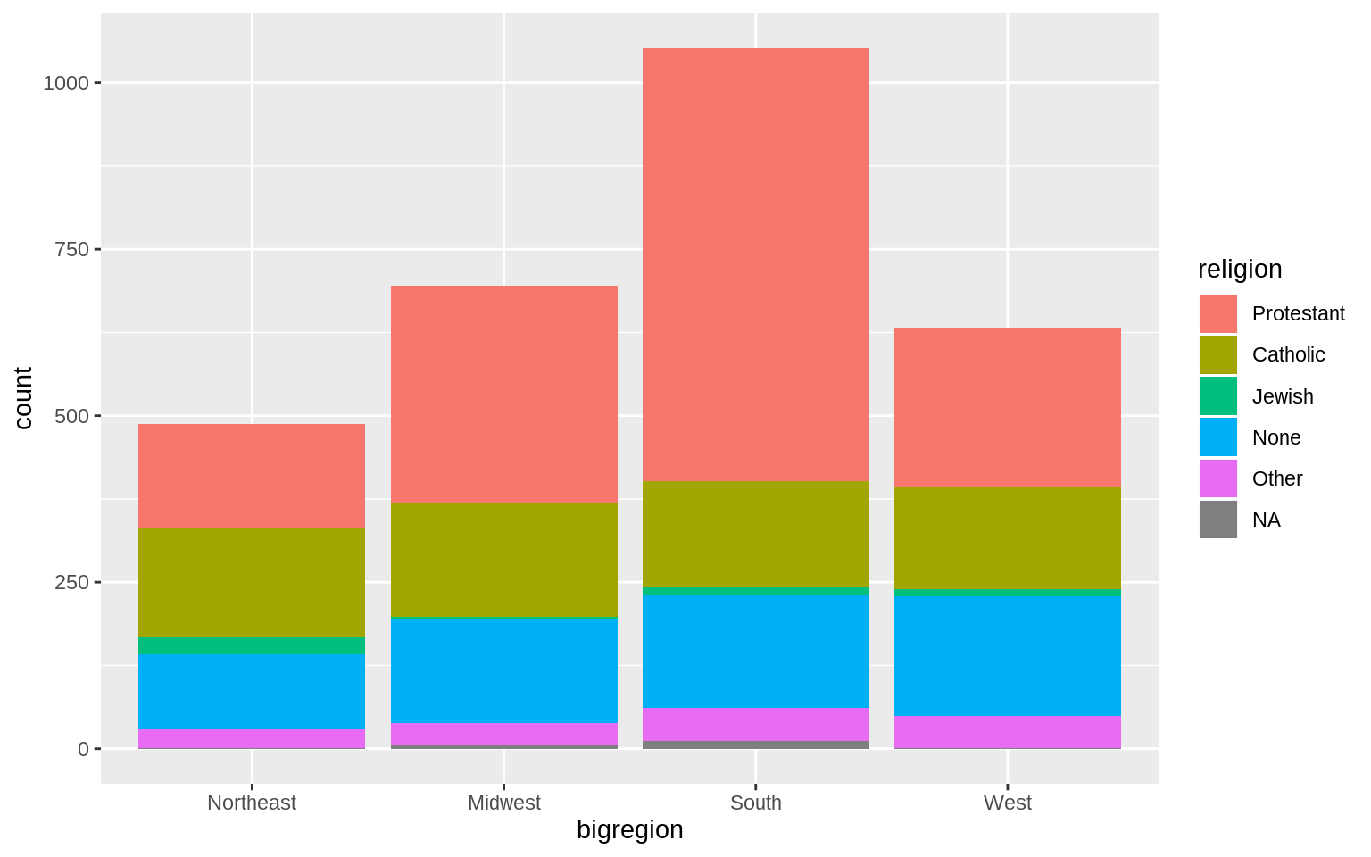
p <- ggplot(data = gss_sm, mapping = aes(x = bigregion, fill = religion))
p + geom_bar(position = "fill")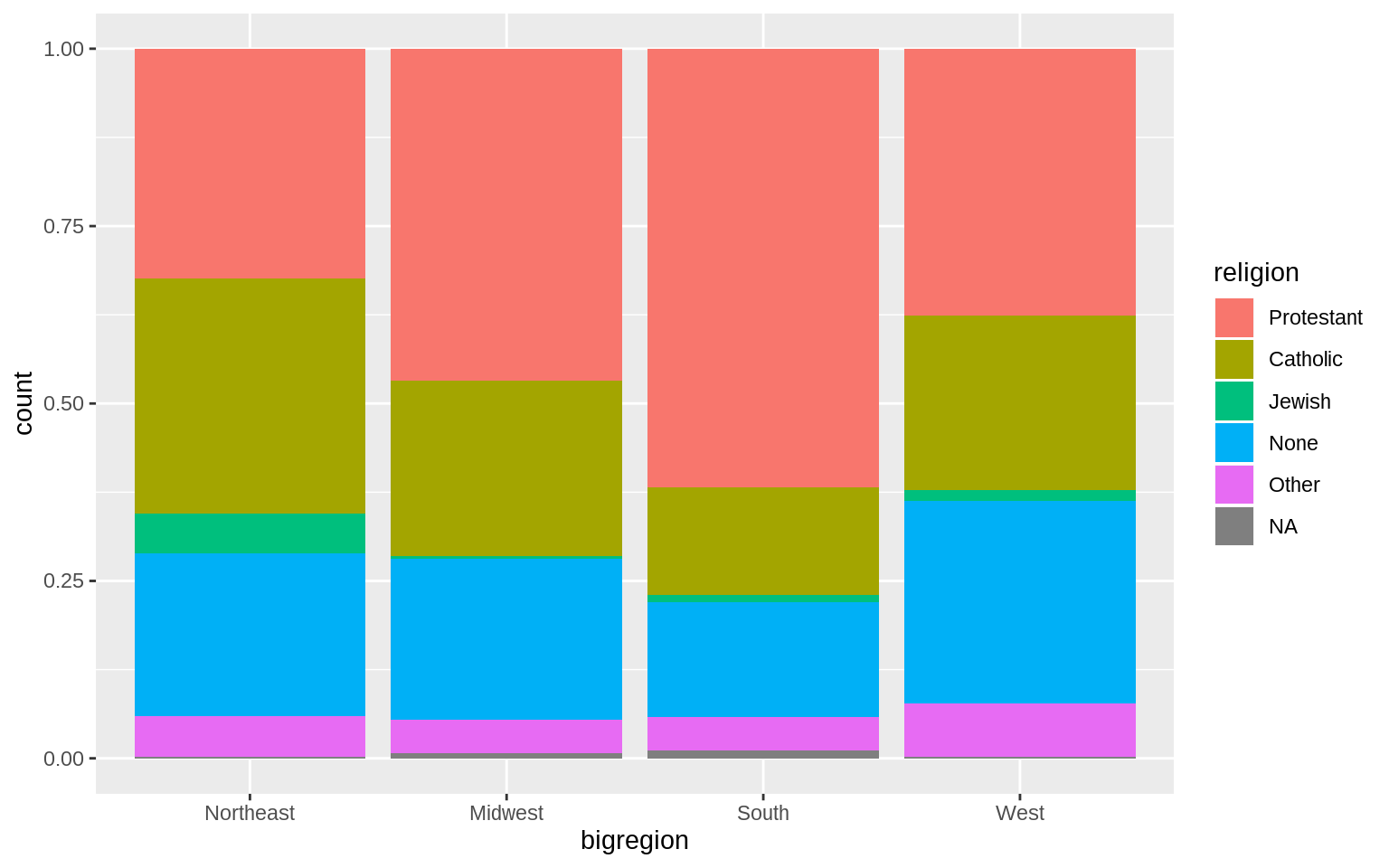
if you want separate bars
p <- ggplot(data = gss_sm, mapping = aes(x = bigregion, fill = religion))
p + geom_bar(position = "dodge", mapping = aes(y = ..prop..,
group = religion))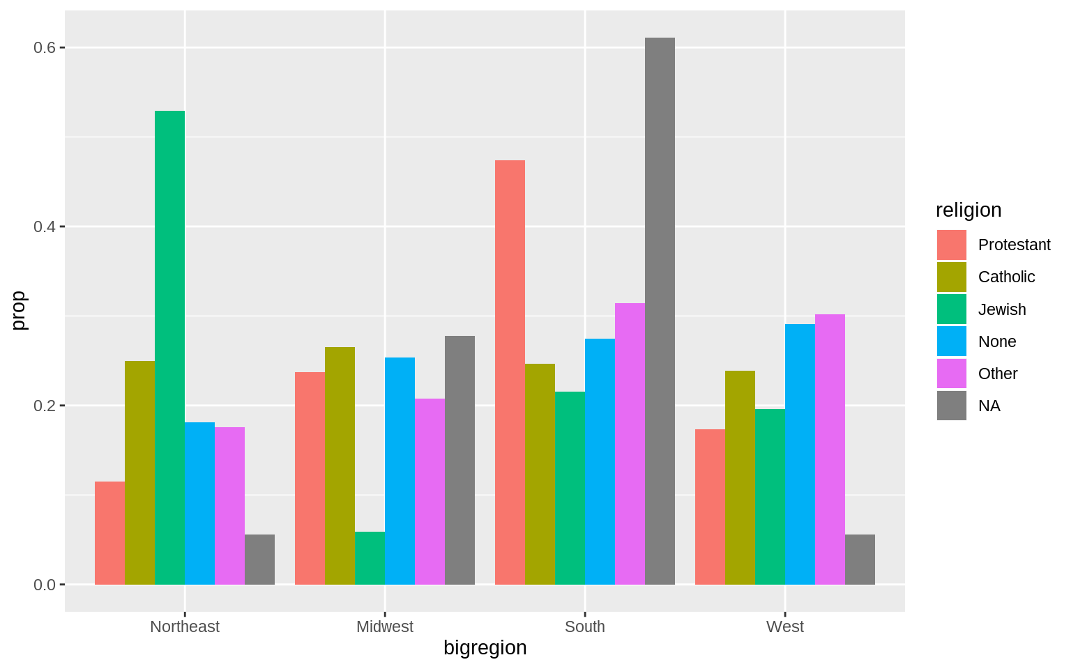 However, they don’t sum to one within each region. They sum to one across regions.
p <- ggplot(data = gss_sm, mapping = aes(x = religion))
p + geom_bar(position = "dodge", mapping = aes(y = ..prop..,
                                               group = bigregion)) +
  facet_wrap(~bigregion, ncol=1)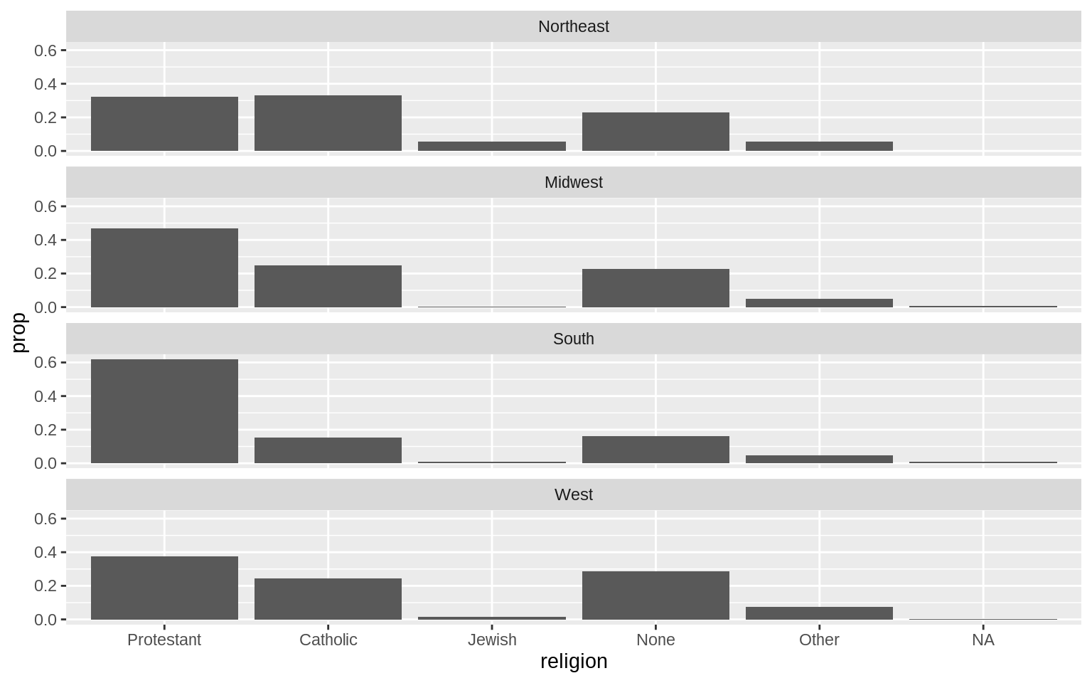
Histgrams and Density Plots
p <- ggplot(data = midwest, mapping = aes( x = area))
p + geom_histogram()
## `stat_bin()` using `bins = 30`. Pick better value with `binwidth`.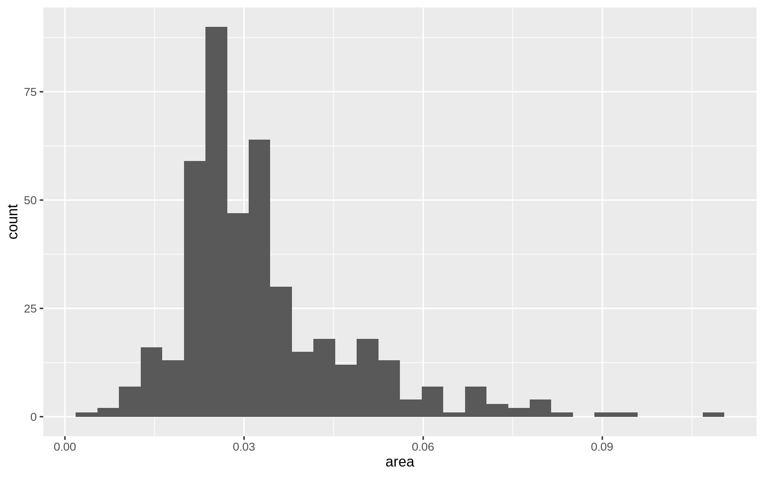
p <- ggplot(data = midwest, mapping = aes( x = area))
p + geom_histogram(bins = 10)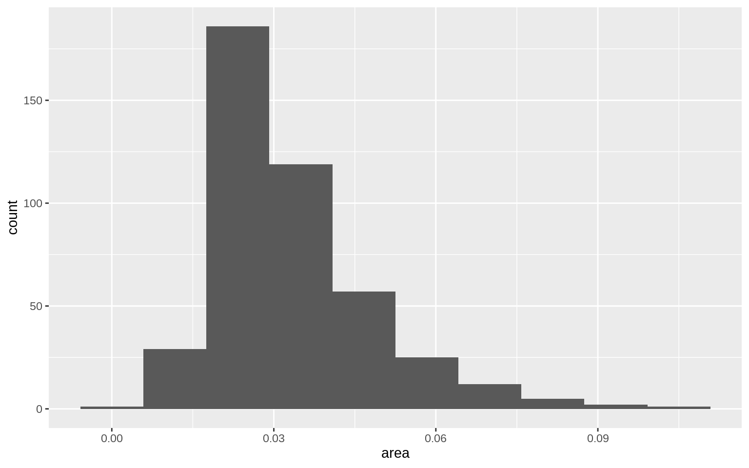
oh_wi <- c("OH", "WI")
p <- ggplot(data = subset(midwest, subset = state %in% oh_wi),
            mapping = aes(x = percollege, fill = state))
p + geom_histogram(alpha = 0.4, bins = 20)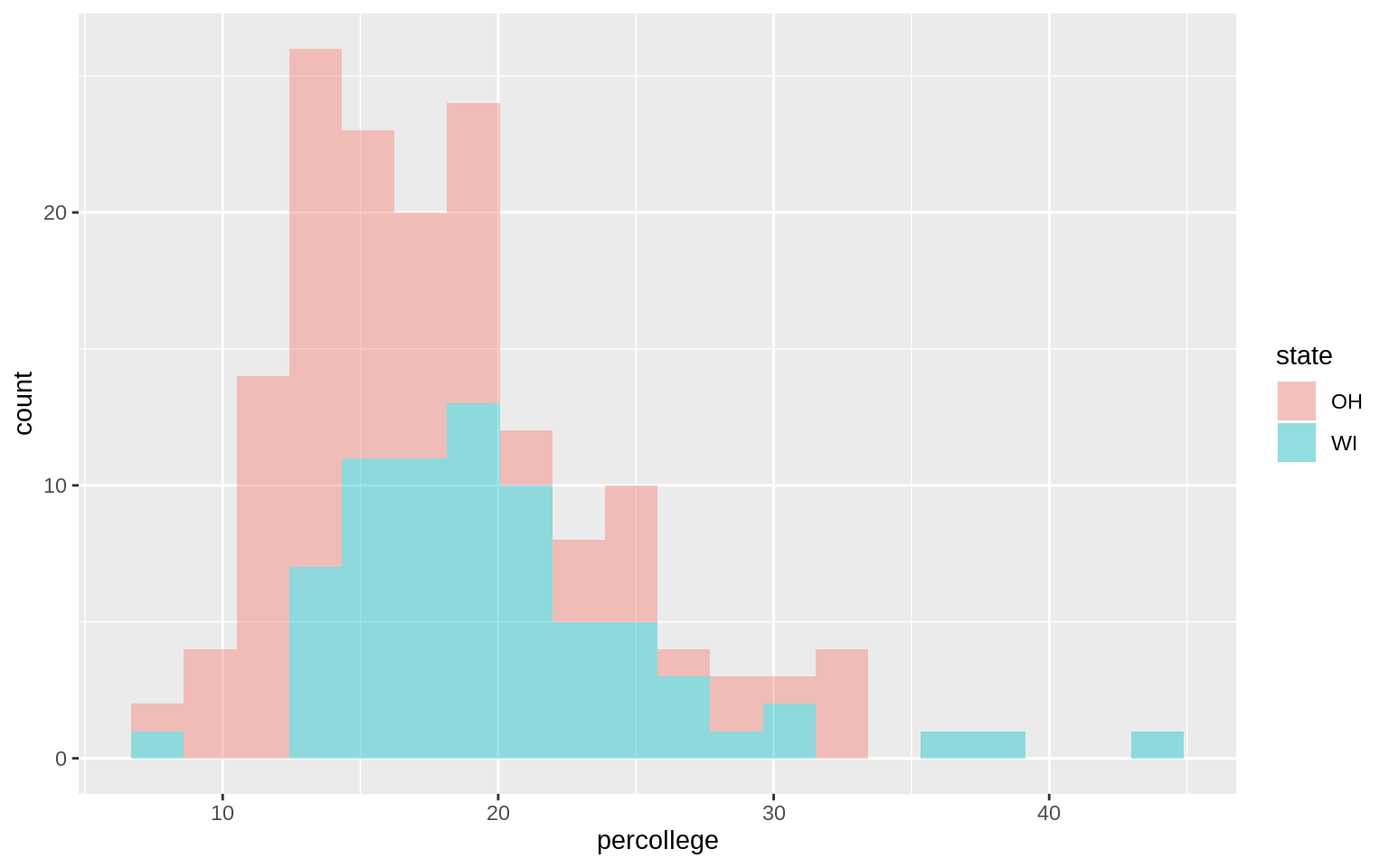
p <- ggplot(data = midwest, mapping = aes( x = area))
p + geom_density()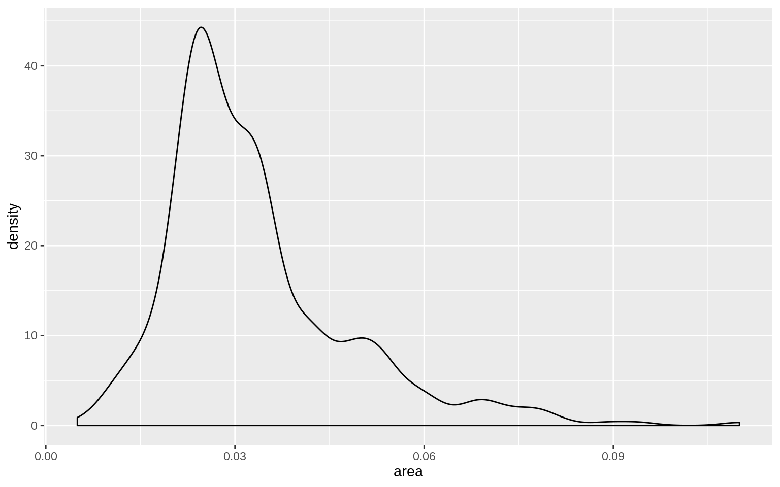
p <- ggplot(data = midwest, mapping = aes( x = area, fill = state,
                                           color = state))
p + geom_density(alpha = 0.3)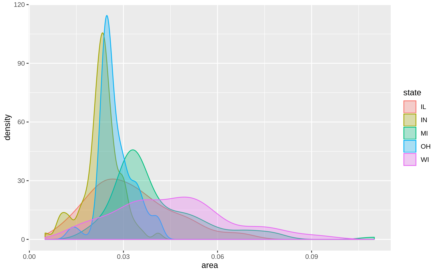
Avoid Transformations When Necessary
p <- ggplot(data = titanic, mapping = aes(x = fate, y = percent,
                                          fill = sex))
p + geom_bar(position = "dodge", stat = "identity") + theme(legend.position = "top")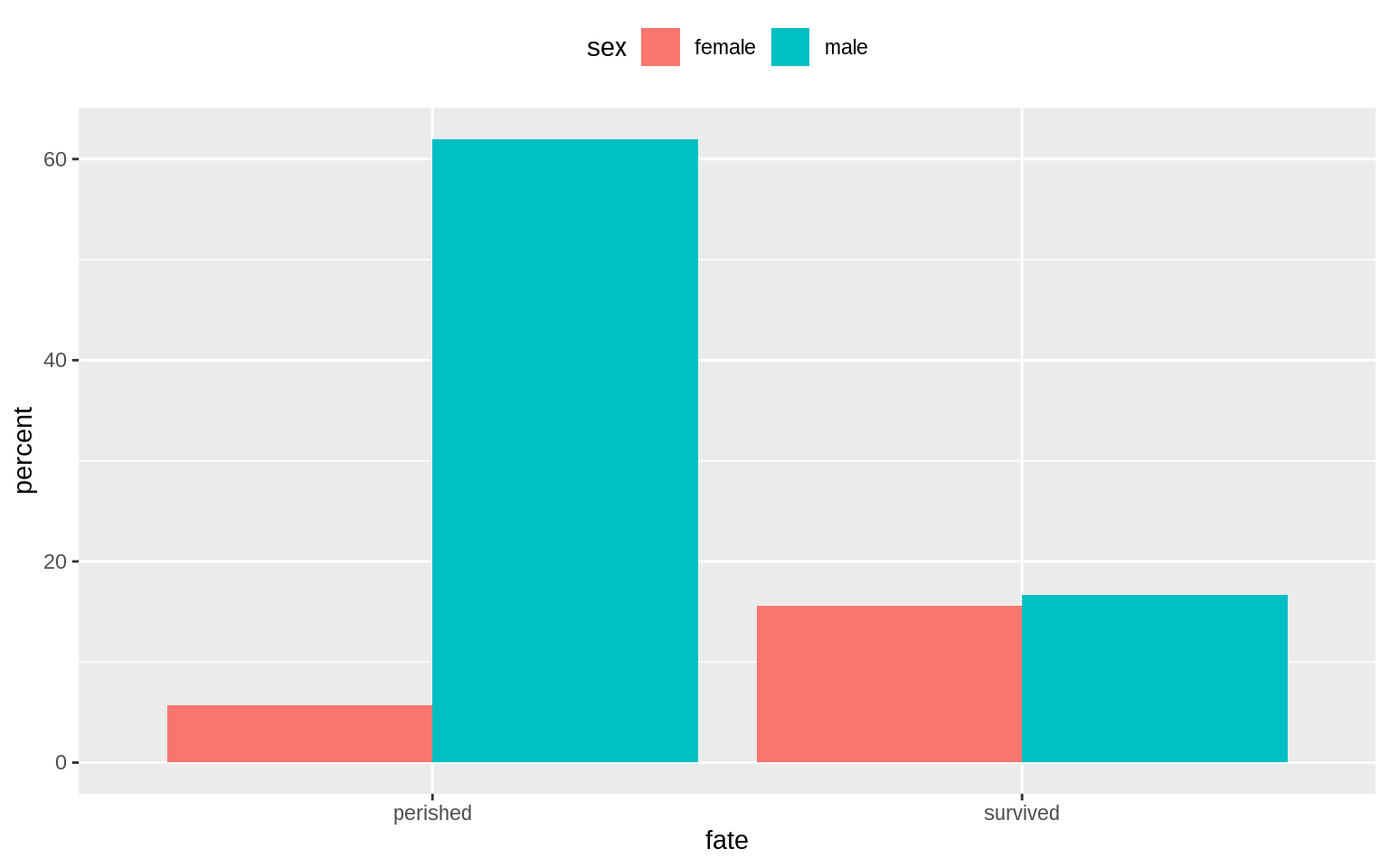
p <- ggplot(data = oecd_sum,
            mapping = aes(x = year, y = diff, fill = hi_lo))
p + geom_col() + guides(fill = FALSE) +
  labs(x = NULL, y = "Difference in Years",
       title = "The US Life Expectancy Gap",
       subtitle = "Difference between US and OECD
       average life expectancies, 1960-2015",
       caption = "Data: OECD. After a chart by Christopher Ingraham,
       Washington Post, December 27th 2017.")
## Warning: Removed 1 rows containing missing values (position_stack).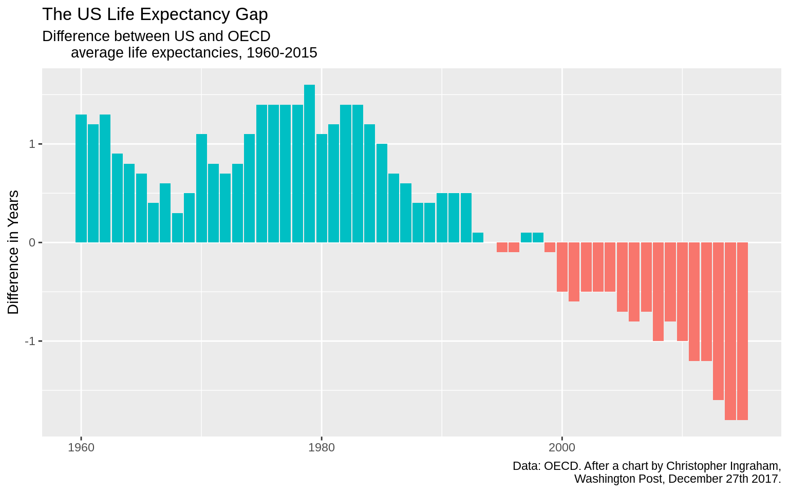
Yihong WANG
Wayfaring Stranger